
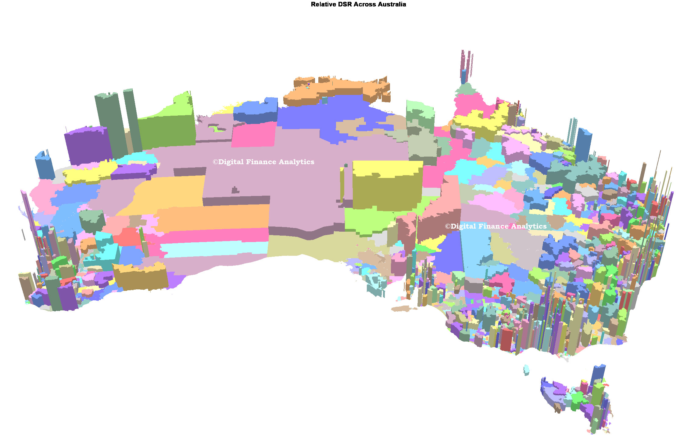
Continuing our detailed analysis of mortgage LVR, DST and LTI across Australia, using data from our houshold surveys, today we feature a 3D map of relative Debt Service Ratios (DSR) by postcode. There are some interesting variations. The greater the height, the higher the DSR.
As we said in our earlier post, DSR is is the ratio between gross household income and the amount paid on the mortgage. More specifically, the DSR is defined as the ratio of interest payments plus amortisations to income. As such, the DSR provides a flow-to-flow comparison – the flow of debt service payments divided by the flow of income. We think the DSR is an important lens to look at households debt footprint, but the ratio is highly sensitive to interest rates because as interest rates fall, the ratio improves. Current DSR ratios are often seen as reasonable because of the current ultra low rates, but of course that tells us nothing about the impact of rising rates later. The average DSR is 16.8, but there is a very wide spread.
One thought on “Debt Servicing Ratio 3D Mapping Highlights Mortgage Hot Spots”