BIS Banking Benchmarks – Where Australian Banks Stand

The BIS published their 84th annual report 2013-14 recently. As well as discussing the merits of central banks relying on low interest rates to try and drive recovery from 2007, and the risks in this strategy with regards to laying the foundations for GFC mark II thanks to expanding credit; there is some interesting data on relative bank performance across several countries. We will focus attention on this data, recognising of course that making cross country comparisons is fraught with dangers because of differences in reporting. That said there are some interesting points to consider. We look at Profitability, Net Interest Margins, Losses and Costs. In each case, I have sorted the countries by the relevant 2013 data, to highlight where Australia appears relative to its peers. The data shows the number of major banks in each country, and they have averaged the results, giving three cuts of data, 200-2007, 2008-2012 and 2013. All the BIS metrics are calculated relative to total bank assets.

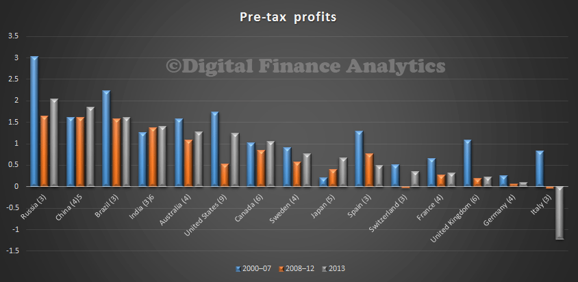
Lets first look at relative profitability.  We see that Russia, China, Brazil and India all reported profitability higher than the Australian banks. However, Australia has the most profitable banks amongst advanced western countries, and is significantly more profitable than banks in Canada, Germany and UK. It is also worth noting that in Australia, banks are still not as profitable, relative to assets as they were before the GFC. But then, that is pretty consistent across the sample countries.

BISJune14-ProfitSo, what is driving relative profitability? Could it be net interest margins? Well, comparing margins relative to assets, Australia is somewhere in the middle, the highest margins are returned from Russia and Brazil, the lowest margins from Switzerland and Japan. Margins in Australia are however higher than Canada, Italy, UK and France. Higher margins, in my view reflect limited real competition, and we know that Australian banks have been repairing their margins by not passing on recent lower funding costs to borrowers, or savers. Small business customers are being hit quite hard. So, banks in Australia are more profitable thanks to higher margins, in a relatively benign environment competitively speaking.

BISJune14-NIMLets look at losses. Here Australian banks have some of the lowest loss rates in the sample. The UK and USA have higher rates of loss, as do the developing economies. Only Japan. Switzerland, Sweden and Canada have lower loss rates. Actually banks in Australia have reduced their provisioning and returned some of these earlier provisions to enhance profitably recently.

BISJune14-Loss
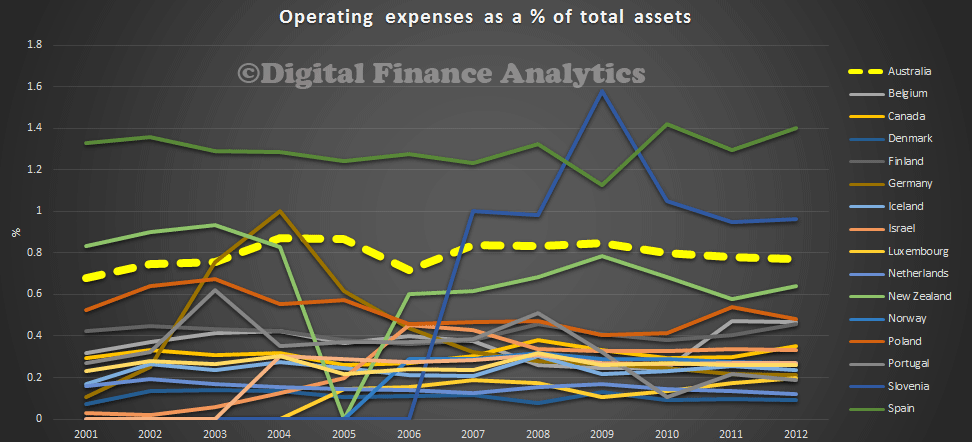
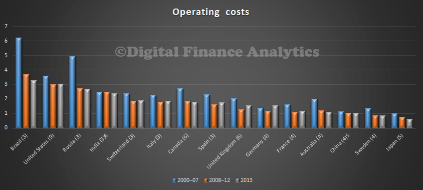
Finally, we look are operational costs. Here again Australian banks rank well, with some of the lowest costs as a proportion of assets of all countries. Many countries including the UK. Canada and USA have higher operating costs.

BISJune14-CostsSo, putting that all together, what can we conclude. Australian banks are some of the most profitable, thanks to efficient operations, low loss levels and relatively high margins. That strength should serve us well if the BIS scenario of rising interest rates comes true. However, we should not loose sight of the fact that the big four march together when in comes to pricing, products and fees. There is ample room for banks to become more competitive, and drive margins lower. Its unlikely though they will because they all enjoy the fruits of the current environment, at the expense of Australia Inc. The argument that shareholders benefit many be true, but it misses the point because that excess profitability dampens broader economic activity, thanks to higher ongoing costs.

APRA Reports ADI Housing Lending Is Up In May To $1.25 trillion

Alongside the RBA data, APRA released the latest monthly banking statistics for May, covering the Authorised Deposit Institutions (=Banks). Total housing loans was reported at $1.25 trillion, up from $1.245 trillion in April. The RBA number, which we reported already, was $1.36 trillion, the difference is the non-bank sector, at around $110 billion, around the same as last month.

Looking at the detail in the APRA data, we look first at housing lending. The big four maintain their market leading positions, with CBA the largest home loan lender.

ADIMay2014HousingLooking at the relative share of owner occupied to investment home loan lending, whilst some of the smaller players lend a greater proportion, Westpac is slightly behind Bank of Queensland, but the largest lender with the greatest proportion of investment loans. Nab has the lowest share of investment loans amongst the four majors.

ADIMay2014HousingRatioTurning to Securitisation, Members Equity leads out, with Bendigo, Westpac and AMP following.

ADIMay2014SecuritisationLooking at Credit Cards, CBA is in first place, with Citigroup in fifth.

ADIMay2014CreditCardsIn the business bank area, National Australia Bank is the largest business bank, with CBA following. The bulk of the lending is to the non financial corporation sectors.

ADIMay2014BusinessFinally here is a snapshot of total lending, showing that CBA is the largest lender.

ADIMay2014AllOn the deposit side of the equation, CBA also leads the share of total deposits.

ADIMay2014DepositsLooking specifically at household deposits, CBA leads the banks, with nab in fourth place, behind ANZ.

ADIMay2014Household-Deposits

Housing Lending Up, Again, in May – RBA

The RBA released their financial aggregates for May 2014 today. Housing lending now totals $1.36 trillion, up by $7.2 billion, a growth rate of 0.5% in the month, and 6.2% in the past 12 months. Investment lending grew at 0.8% in May, whilst owner occupied loans grew at 0.4%.

RBAMay2014HousingTypeInvestment lending is growing faster, at 8.3% compared with 5.2% for owner occupation over 12 months. These are all seasonally adjusted numbers.

RBAMay2014HousingTrendPersonal credit fell again, by 0.3% in the month, giving an annual rate of 0.3%, and business lending grew 0.2%, giving and annual rate of 2.7%. So, the focus on lending for housing continues.

Australian Household Loan To Income Ratios Are Worse Than In The UK

As we highlighted recently, the Bank of England is supporting the imposition of loan to income (LTI) ratios on banks in the UK, as a way to manage risks in the housing sector. So today, we start to explore loan to income data in Australia, captured though our rolling programme of household surveys. We start with some average national data, then look at the NSW picture in more detail. The UK recommendation, was to ensure that mortgage lenders do not extend more than 15% of their total number of new residential mortgages at Loan to Income ratios at or greater than 4.5. This recommendation applies to all lenders which extend residential mortgage lending in excess of £100 million per annum.

So whats the Australian data? We start by looking at the average LTI by postcode. The histogram shows the average LTI by household, calculated at a postcode level, and including all households with a mortgage. Income means the gross annual income, before tax or other deductions. We see that the LTI varies between 2.25 and 8. This is the ratio of household income to the size of the mortgage. We see a peak around 4.25-4.5 times, and a second peak at 6.25. Newer loans are more represented in this second peak.

Loan to income is a good indicator, because it isolates movements in house prices altogether from the data. The rule of thumb when I was working in the bank as a lender was to take 3 times the first income, and add one times the second income as a measure of the loan which was available to a household. Although rough, it was not too bad. Since then, lending rules have changed and criteria stretched. This ability to lend more has in turn led to higher house price inflation, thanks to supply/demand dynamics.

Australia-LTI-Average The current data from the UK shows that LTI’s there are spread between 0 and 6. Interestingly, we see that in their forward scenarios they suggest an emerging second peak around an LTI of 5 times. So LTI’s in Australia are more stretched than in the UK. The regulators here do not report LTI data regularly. This is a significant gap. LTI2We can map relative LTI average to post code. Here is the Sydney example, which highlights that there is a significant geographic concentration of high LTI loans in the western suburbs of Sydney.

Sydney-LTIThere is, further, a correlation between higher LTI loans and Mortgage Stress. Here is the stress data for Sydney.

NSW-Mortgage-StressThese are concerning indicators. In addition as we dig into the data we find that the second peak in the LTI data relates to younger buyers, often first time purchasers. They are highly leveraged into the property market, and are surviving thanks to the very low interest rates available today. If rates rise, this could be a problem. This suggests that the loan to income situation in Australia is more adverse than the UK scene. Whilst we note the UK regulator is acting, there is no macro-prudential intervention in Australia.  There should be.

Later we will present additional data across the other major centres, and examine in more detail those who are recent purchasers.

UK To Cap High Loan To Income Mortgage Loans

The UK Financial Policy Committee is is charged with taking action to remove or reduce systemic risks with a view to protecting and enhancing the resilience of the UK financial system. In their June 2014 report they highlighted that the recovery in the UK housing market has been associated with a marked rise in the share of mortgages extended at high loan to income multiples. Increased household indebtedness may be associated with a higher probability of household distress, which can cause sharp falls in consumer spending. Falls in consumption can in turn weigh on wider economic activity, increasing macroeconomic volatility in the face of shocks to income and interest rates. Furthermore, rapid growth in aggregate credit – which could be associated with a sharp increase in highly indebted households – is strongly associated with subsequent economic instability and the risk of financial crisis. Acting against excessive indebtedness will make the financial system more stable.

As a result, the FPC decided at its June meeting to recommend to the Prudential Regulatory Authority (PRA) and the Financial Conduct Authority (FCA) that they take steps to ensure that lenders constrain the proportion of new lending at loan to income (LTI) ratios at or above 4.5 to no more than 15% of the total number of new mortgage loans. This is because they believe the the aggregate effect of many firms undertaking such lending could pose a risk to financial stability.

They recommend:

“The PRA and the FCA should ensure that mortgage lenders do not extend more than 15% of their total number of new residential mortgages at Loan to Income ratios at or greater than 4.5. This recommendation applies to all lenders which extend residential mortgage lending in excess of £100 million per annum. The recommendation should be implemented as soon as is practicable.”

The PRA have now released a detailed consultation paper on implementing this recommendation. They are intending to implement the recommendation as soon as practicable. The proposed implementation date for these rules is 1 October 2014. The proposed rules would have the effect of limiting to no more than 15% of the total the number of mortgage loans completed by each lender at or greater than 4.5 times LTI. The limit is intended to restrict but not halt the extension of mortgage lending at such LTIs and can thus be thought of as a limit on the flow of very high LTI lending. The measure is designed to capture risks associated with excessive household indebtedness. Lenders will be required to report on this dimension. This relates to mortgages written, not offers made, or decisions in principle. Remortgages are buy-to-let mortgages are excluded. They provide data on the split by LTI in the UK, showing the trends.LTIThey also show scenarios for the potential impact of the policy. If house prices and mortgage approvals grow in line with the central scenario, the impact of the policy action is likely to be minimal. However, if there is more underlying strength in the housing market than in the central scenario, the proposed rule would be likely to restrict the availability of very high LTI mortgages to some households. The proposed policy might then reduce the level of GDP in the short term to the extent that it acts as a binding constraint on mortgage lending. However, even in the upside scenario considered in the June 2014 FSR, the size of the effect would be small (roughly 0.25%). The main benefits of the policy will be to reduce macroeconomic volatility and the likelihood and severity of financial instability.LTI2Two observations for the Australian market. First, we have no macro-prudential policies here despite the fact that they are recommended by several global bodies. Second, the LTI metric is recommended as the policy of choice, and in Australia we do not see regular reporting of LTI data from the banks via APRA or ABS.  Given the high income multiples here, we should be following the UK. In addition the regulators should start to capture and report LTI data.

Care In The Community Growing

The Australian Bureau of Statistics today released some important data on how many people are being cared for informally in the community. They showed that in Australia, 12 per cent of people provide informal care to an older person or to someone with a disability or long-term health condition. There were 2.7 million people providing informal care in 2012 and around 29 per cent of these carers are primary carers. This has grown since 2003. Women were both more likely to be carers, and more likely to be primary carers. There were 1.5 million female carers, and of these 536,700 were primary carers, compared to 1.2 million male carers and 233,100 male primary carers.

Age-Care-5They highlighted that the proportion of primary carers who were spending 40 hours a week or more providing care has also increased. In 2009, 35 per cent of primary carers were spending 40 hours a week or more providing care, for 2012, this has increased to 39 per cent, or about two in five. The greatest proportion of carers was a partner, and tended to be older. Those over 65 years were most likely to be caring. One in five primary carers spent between 20 and 40 hours per week and almost two in five spent less than 20 hours per week

Age-Care-2Age-Care-1Carers provided a range on assistance, from transport, to housework, mobility and healthcare.

Age-Care-3The partner was most likely to provide these services.

Age-Care-4The ABS report highlighted the personal costs incurred by the carer, including reduce job opportunity, lower income and reduction in well-being. Given the demographic  shifts we expect to see an ever greater burden of caring responsibility on the shoulder of carers. The 2.7 million engaged in providing these services are an group which is not fully appreciated by the wider community, but consider the impact on the healthcare system if those being cared for informally were to be inserted back into full time institutional care. Demand for care influences property selection as we highlighted in our earlier post.


Super Fees Are Way Too High In Australia

In an interesting speech yesterday Dr David Gruen Executive Director Macroeconomic Group presented some startling data to the assembled company at the CEDA State of the Nation 2014 event. Citing the Gratton Institute report he said “in 2013, Australian superannuation fees ranged from approximately 0.7 per cent to 2.4 per cent of mean fund size, with fees averaging around $726 per year for a member with a balance of $50,000”. But more significantly, he also cited some international comparative data from the OECD “Although international comparisons are difficult, in 2011, Australia’s average superannuation fees were around three times those in the UK. In aggregate, Australians spend around $20 billion annually, or over 1 per cent of GDP, on superannuation fees”.

Now, looking at the international comparative data, available from the OECD Pension Funds Database, we find Australia is not only more expensive than the UK, but most other countries where super, or a pension equivalent exists, and good data is available. The OECD data is a ratio of expenses to assets, rather than fees. We see that Australia is consistently more expensive than other countries, other than Spain and Slovenia. New Zealand is lower, than Australia, slightly. Does the difference reflect the size of our superannuation industry, because whilst we have per capita, the largest super pools, we do not seem to be reaping scale benefits. Why is this? Could it have something to do with the industry concentration in the sector?

SuperFeesOECDDr Gruen goes on to say:

A microeconomic reform that permanently reduced costs across the economy by a few tenths of 1 per cent of GDP would be considered a significant and worthwhile reform. Significant reductions in superannuation fees would have widespread benefits for society as a whole.

This problem is a global one. In 2009, the Squam Lake Working Group – probably the most prestigious group of finance academics ever assembled, with representatives from a variety of different viewpoints, including Frederic Mishkin from Colombia University, Nobel Prize winner Robert Shiller, John Cochrane from the Chicago School and Raghuram Rajan, now the Governor of the Reserve Bank of India – had this to say:

‘High-fee funds argue that their fees are justified by superior performance. A large body of academic research challenges that argument. On average, high fees are simply a net drain to investors. While some investors might gain by selecting successful high-fee funds, the negative-sum nature of the process implies that other investors must lose even more. Most employees saving for retirement are poorly placed to compete in this game. They should not be forbidden from doing so, but disclosure of high fees and a “surgeon general’s warning” are appropriate.’6

The impact on fees of recent initiatives is unclear at this stage. In particular, the introduction of MySuper and Superstream should make the sector more efficient and push down costs — and there is some evidence that this is occurring. Nevertheless, there needs to be policy consideration of further options to increase competition and drive down costs. Given the stakes, this is an important area for the Financial System Inquiry to examine.

Finally, he makes an important point about the need to provide for income in retirement, rather than simply wealth accumulation, and a call for product innovation in this area.

The key focus of superannuation should be on the provision of retirement income, rather than primarily on wealth accumulation. As more Australians move into retirement, it will become increasingly important for the industry to provide the range of products that people need to manage the financial aspects of their retirement.

It will be increasingly important for the private sector to help manage longevity risk through income stream products such as insurance or pooled products. Most life insurance products do not address longevity risk and the individual immediate annuity market in Australia is small. At issue is the availability of a range of products that balance risk transfer and affordability and the identification of any industry, taxation or regulatory impediments to developing cost effective products that enable individuals to manage longevity risk.

Longevity risk therefore is an important issue, presenting an opportunity for innovation by the superannuation industry. It is also an important issue to get right given the rapidly rising numbers of retirees. In particular, we do not want longevity risk ‘solutions’ that lock retirees into inappropriately high fees and fail to provide sufficient incentives for the superannuation industry to become more efficient.

Our research into the Australian Annuities industry, which we summarised in an earlier post, highlighted that many households were not aware of how much they would need in retirement, were unaware of the average life expectancy, and that annuities were seen as a potentially risky, high cost and inflexible solution:

We asked about their attitudes to annuities. Most said they did not understand them, thought they would get ripped off, and were a poor choice because they wanted to keep control. They also made the point that governments might change the rules on them, and in any case nearly 80% said they would rely on government pensions to see them through.

The bottom line is that not many households are interested at the moment. Younger households might be, but of course later in life. So the demand side of the equation suggests that annuities will not be the product of choice for many anytime soon.

The broader issue of a mismatch between savings and income expectations, and future life expectancy is a bigger and more serious issue, as the government will not be able to afford to extend support to the every growing ranks of baby boomers who have exhausted their superannuation savings. This looks like a significant issue which requires significant changes in education and perhaps policy.

It will be interesting to see what transpires from the Financial System Inquiry, and whether we see further product innovation develop, alongside pressure to reduce fees. Given the big banks have a significant footprint in superannuation, we can expect opposition to fee reduction, and if fees do fall significantly, then pressure on profitability of the majors. Finally, it is worth noting that this speech was posted on the Treasury website!

Digital Business On The Rise – But Potential Untapped

When we released our Small Business Survey, we included a section on the impact of digital business and the internet was having on them. So we were interested in the latest ABS data on IT Use and Innovation in Australian Business. They found that more than one in four Australian businesses had a social media presence as at 30 June 2013, up from one in five the previous year, and nearly a third of Australian businesses received orders via the internet during 2012-13. These orders were worth close to $250 billion, which is an increase of almost $10 billion from the year before.

Looking in detail at the data. we find that internet penetration and usage varies by industry. Whilst most businesses now have some form of internet connectivity, a web presence was quite varied, with Arts and Telecommunication/Media most likely to have a web presence, whilst Transport was the least likely. Less than half of Retail businesses receive order via the internet, although more will place orders themselves. Social Media presence varied, with Arts and Media most likely to use this channel. Around 30% of financial services companies use social media, despite the rise of digital banking, as we highlighted in our recent report, the Quiet Revolution.

BusinessIndustryInternet revenue has been rising, and larger business are generating more revenue relative to smaller business.

BusinessInternetSmaller business tend to be less likely to have a web presence, use social media or receive orders via the internet. Our surveys show that many small business are too busy to exploit digital business, or do not see the true potential of the opportunity.

Business0-4Business4-19 Business20-200 Business200+Overall, we believe that many businesses are yet to fully to embrace the potential of digital business. Consumers are highly connected, mostly via mobile devices, so there is huge potential for innovation. The potential is immense, but requires new ways of thinking.


Investors Still Good To Go – Tax Breaks Ahoy!

Today we look at property investor trends in our household surveys series. We have been following the strong growth in investment lending, so was interested to see what property investors were thinking. Their appetite to invest appears to be slowing as we showed in our earlier post. Looking at those who are thinking about transacting, we find they are still attracted by the potential appreciation of property values, and the tax efficient nature of these investments. Low finance rates are a little less important, whilst getting returns better than deposits was up.

InvestorTransactDFAJun14Turning to the SMSF property investment area, the drivers are quite similar, although the potential for tax efficient investments is significant. They are also attracted by the leverage they can obtain.

InvestorSMSFTransactDFAJun14We have seen some interesting shifts relating to where potential SMSF property investors are getting their advice. The role of real estate agents has diminished in recent months (perhaps in reaction to the strong warnings from ASIC?) whilst mortgage brokers and internet forums and other sites have become more significant. We also see increasing personal knowledge guiding the trustees.

InvestorSMSFAdvisortDFAJun14Our last data point relates to the proportion of superannuation which is aligned to residential or commercial property. The most significant move was in the 10-20% range.

InvestorSMSFDistDFAJun14

How Household Property Buying Intentions Have Changed Since 1995

Today we continue our series on the latest results from our households surveys. Following our recent posts, we had several people ask about trends around some of the metrics we use. We have been running these surveys since 1995. So in this post we present a summary of trends from 1995 onwards. It provides an interesting perspective on how households have changed their behaviour in recent years.

IntentionsDFAJun14To explain the data, the bars show the rising trend in those households who are property inactive (inactive because they do not own property, and do not intend to in the foreseeable future). We show the percentage as a raw split, and also an adjusted split, to take account of population growth across states. The ratio of active to inactive households varies across individual states, and across geographic bands within states.

We also show the proportion of households who said they intended to transact in the next 12 months, and also their expectations, at the time, of house price movements for the next 12 months. Intention to transact was sitting at around 15% of households, until it fell as a result of the GFC. Since that time, it has powered ahead, and is significantly above long term trend – though note the recent fall. Turning to the proportion of households expecting property prices will rise in the coming 12 months, this is more variable, although the long term average prior to the GFC was close to 50%. If fell significantly in 2008 and 2009, before recovering, and reaching a high of 80% in 2013. It is still above long term trend, though falling slightly.

This data highlights the significant demand pressures on the property market, and helps to explain the high prices being achieved, although our interpretation is that the peak is now passed.

Next time we will consider households considering investment property.