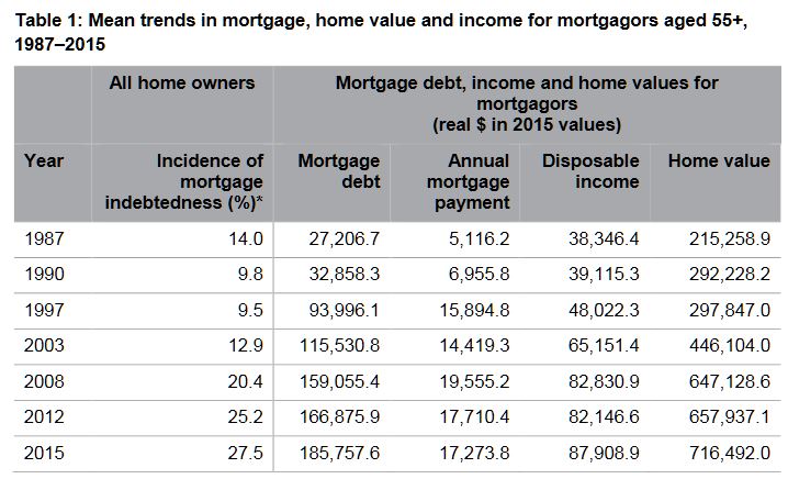
Between 1987 and 2015, average real mortgage debt among older Australians (aged 55+ years) blew out by 600 per cent (from $27,000 to over $185,000 in $2015), while their average mortgage debt to income ratios tripled from 71 to 211 per cent over the same period, according to new AHURI research.
The research, Mortgage stress and precarious home ownership: implications for older Australians, undertaken for AHURI by researchers from Curtin University and RMIT University, investigates the growing numbers of older Australians who are carrying high levels of mortgage debt into retirement, and considers the significant consequences for their wellbeing and for the retirement incomes system.
‘Our research finds that back in 1987 only 14
per cent of older Australian home owners were still paying off the mortgage on
their home; that share doubled to 28 per cent in 2015’, says the report’s lead
author, Professor Rachel
ViforJ of Curtin University.
‘We’re also seeing these older Australians’ mortgage debt burden increase from
13 per cent of the value of the average home in the late 1980s to around 30 per
cent in the late 1990’s when the property boom took off, and it has remained at
that level ever since. Over that time period, average annual mortgage
repayments have more than tripled from $5,000 to $17,000 in real terms.’
When older mortgagors experience difficulty in meeting mortgage payments,
wellbeing declines and stress levels increase, according to the report.
Psychological surveys measuring mental health on a scale of 0 to 100 reveal
that mortgage difficulties reduce mental health scores for older men by around
2 points and an even greater 3.7 points for older women. Older female
mortgagors’ mental health is more sensitive to personal circumstances than
older male mortgagors. Marital breakdown, ill health and poor labour market
engagement all adversely affect older female mortgagors’ mental health scores
more than men’s.
‘These mental health effects are comparable to those resulting from long-term
health conditions,’ says Professor ViforJ. ‘As growing numbers of older
Australians carry mortgages into retirement the rising trend in mortgage
indebtedness will have negative impacts on the wellbeing of an increasing
percentage of the Australian population.’
High mortgage debts later in life also present significant challenges for housing
assistance programs. The combination of tenure change and demographic change is
expected to increase the number of seniors aged 55 years and over eligible for
Commonwealth Rent Assistance from 414,000 in 2016 to 664,000 in 2031, a 60 per
cent increase. As a consequence the real cost (at $2016) of CRA payments to the
Federal budget is expected to soar from $972 million in 2016, to $1.55 billion
in 2031. The unmet demand for public housing from private renters aged 55+
years is also expected to climb from roughly 200,000 households in 2016, to
440,000 households in 2031, a 78 per cent increase.
There are also challenges for Government retirement incomes policy. The burden
of indebtedness in later life is growing; longer working lives and the use of
superannuation benefits to pay down mortgages are increasingly likely outcomes.
“Childcare is up 28%, out of pockets to see the doctor up 20%,
specialists … up nearly 40%,” he said. And then the punchline:
“everything is going up, except your wages.”
Statistically, it wasn’t true. The official rate of inflation was just 1.3%. The official rate of wage growth was 2.3%.
I haven’t asked him, but I wouldn’t be surprised if he kept saying it because his focus groups told him that’s what people felt.
Funded by the Australian government and managed by the Melbourne
Institute of Applied Economic and Social Research, HILDA is one of the
most valuable tools Australian social researchers have.
It examined the lives of 14,000 Australians in 2001 and then kept
coming back to them each year to discover what had changed. By surveying
their children as well, and in future surveying their children, it will
be able to build up a long-term picture of how circumstances change
over the course of lives and generations.
It can be thought of as Australia’s Seven Up!,
the British TV series that keeps going back for updates on the lives of
14 children it first examined when they were seven. Except that HILDA’s
results have statistical significance, and the questions are detailed,
asking among other things about depression and anxiety, work-life
stress, stress in relationships, and illicit drug use.
We are right to feel no better off…
The Australian Bureau of Statistics does indeed find that wages are
climbing faster than prices, as they almost always have, but because it
doesn’t examine what happens to a particular household over time it can
tell us little about whether an individual’s experience of things is
getting better or getting worse.
HILDA gets a handle on each household’s disposable income by asking
each member of the household about their gross income from wages,
benefits, investments and other sources and then deducting its estimate
of taxes. It gets a handle on the real (inflation-adjusted) changes by
adjusting its totals for changes in the consumer price index.
It finds that for the thousands of households it interviewed, real
disposable income grew strongly during the first nine years of the
survey, between 2001 and 2009. Then, after the global financial crisis,
for the eight years between 2009 and the 2017 results released today,
that growth stalled.
Expressed in today’s dollars, the average annual real disposable
income of those households climbed by A$19,773 between 2001 and 2009,
about $2,472 per year.
But most of the growth was during the mining boom that stretched from
2003 to 2009 when the average annual real disposable household income
climbed about $3,000 per year, as did the income of the more
representative median (or middle) household.
Since 2009 and the global financial crisis, the average and the median have moved in different directions.
The average houshold’s annual real disposable income has climbed a
further $3,156. The median (or typical) household’s income has fallen
$542, although not steadily. The graph shows it falling between 2009 and
2011, climbing in 2012, and changing little thereafter.
…and as if it’s harder to get ahead…
It has also become harder to “get ahead”, in the phrase used often by the prime minister.
Between 2001 and 2005, 40% of the households in the bottom fifth of
earners (the bottom qunitile) moved out of it into a higher one. In more
recent years, between 2012 and 2016, a lower 38.5% moved up.
Between 2001 and 2005, 44% of the households in the top qunitile had
to move down to let other households take their place. In more recent
years, between 2012 and 2016, only 41.5% have moved down.
Getting a long way out of the income circumstances you were born in
is a long-shot, according on HILDA’s early attempt at measuring
intergenerational mobility.
People who were 32-34 years old in 2015-17 are highly likely to be in
the same household income quintiles as those people found themselves in
when they were 15-17 back in 2001-03.
There’s only a one in ten chance of moving from the bottom quintile
as a teenager to the top quintile in your early thirties. There’s a 37%
chance you’ll stay put.
Even among teenagers who grew up in the middle quintile, there’s only
a 17% chance of making it to the top, along with a 19% chance of moving
one rung up.
Interestingly, women turn out to be more tied to the income their
families had when they were children than men, and both men and women
tend to stay more closely tied to their mother’s income than their
father’s.
Interestingly, women turn out to be more tied to the income their
families had when they were children than men, and both men and women
tend to stay more closely tied to their mother’s income than their
father’s.
…yet we are less reliant on welfare, even pensions…
When HILDA began in 2001, 39% of Australians aged 18 to 64 were
living in a household that received government welfare of some kind. By
2017, that proportion had fallen to 31%, but almost all of the drop
happened before the global financial crisis in 2009.
Most of us are still in households that have received something from
the government over a 10-year period: 58% of working age Australians in
2017, down from 64% in 2010.
Among older Australians aged 65 and over, reliance on the age pension
and other benefits for more than half of income needs has dropped from
60% to 51%.
Among new retirees aged 65 and over, the proportion receiving the age
pension has fallen from 76% of men and 74% of women to just 60% of men
and 55% of women.
But while the growth of compulsory superannuation is likely to be
part of the story, almost all of the decline happened before the
financial crisis in 2009, suggesting that the destruction of wealth in
the crisis kept people on the pension who otherwise might not have
needed it.
…and gender roles are changing
Before the financial crisis, almost three quarters (73%) of men of
traditional working age were employed full-time. After the crisis, the
rate slipped to a much lower 67% and stayed there.
Female full-time employment was also hit by the crisis but has since
almost totally recovered to be just a fraction below its pre-crisis peak
of 39.6%.
Women’s hourly earnings are also climbing faster than men’s, up 24% between 2001 and 2017, compared to 21% for men’s.
While women have always been more likely than men to be employed
casually, since the crisis male casual employment has climbed while
female casual employment has declined. The two are now as close as they
have ever been, with women now only six percentage points more likely
than men to be employed causally.
In dual-earner male-female couples, the proportion in which the woman earns more than the man has climbed from 22% to 25%.
The woman being the main breadwinner is more common in couples that
aren’t legally married and don’t have children. It is also far more
common in the regions than in cities and among couples in which the man
doesn’t have a university degree.
Men in predominantly female breadwinner households are somewhat less
happy with their lives and with their relationships, as (perhaps
surprisingly) are women.
Fathers tend to agonise more about work-family conflict than mothers,
notwithstanding the much greater amount of housework and childcare work
performed by mothers. The men who worry the most work long hours, have
irregular shits and very young children. A mother working the same hours
as a father will typically be more conflicted.
Most parents suffering high work-family conflict get out of it within
a year or two, often by managing things better and sometimes by
changing jobs. Those suffering high work-family conflict are 50% more
likely than others to separate the next year.
HILDA’s great strength is that it will be able to follow those
parents and their children and all the other families it surveys and
tell us what happens next. Rather than being an Australian version of
Seven Up!, it might be better described as Australia’s never ending
story. Its co-director Roger Wilkins says its design allows it to be
“infinitely lived”.
Do you feel that, overall, you’re “better off” than you were in the past? Or that things are getting worse, or have plateaued?
We now have the data to get us a pretty good answer to that question, right down to the detail by “family types”, as categorised by the Household, Income and Labour Dynamics in Australia (HILDA) Survey. Starting in 2001, this longitudinal survey now tracks more than 17,500 people in 9,500 households.
The interactive below lets you drag and drop your family members into the house to see what the HILDA data reveal.
One measure we’re showing is what economists call “equivalised income”. That’s different to your total household income; here’s how the HILDA report explains it:
Overall, median equivalised incomes have gone up since 2001 for all family types, but some have fared better than others, as this chart from the full HILDA report shows:
For the purposes of interpreting the HILDA data, you might need to be a bit flexible when deciding which “family type” applies to you. For example, a household with two single, adult sisters living together will be classified as two single-person “families”, even though they might see themselves as a family unit.
And it’s worth remembering, as the HILDA report notes:
… some households will contain multiple “families”. For example, a household containing a non-elderly couple living with a non-dependent son will contain a non-elderly couple family and a non-elderly single male. Both of these families will, of course, have the same household equivalised income. Also note that, to be classified as having dependent children, the children must live with the parent or guardian at least 50% of the time. Consequently, individuals with dependent children who reside with them less than 50% of the time will not be classified as having resident dependent children.
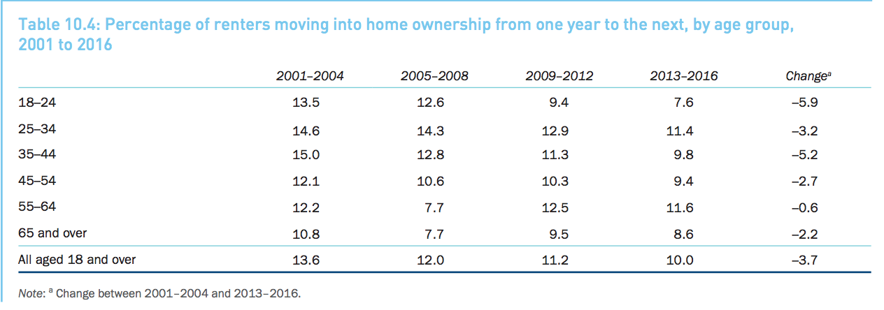
Renters are quickly becoming a growing demographic in Australia, as fresh research reveals the proportion of Australian renters becoming homeowners has nosedived.
In news that will hardly come as a surprise to most millennials, the number of Australian renters eventually becoming homeowners has plummeted over the last 15 years – particularly for those between the ages of 18 and 24.
Undoubtedly as a result of this, the survey correspondingly found people aged between 15 and 24 are choosing to live with their parents longer.
Melbourne Institute deputy director and report co-author Roger Wilkins told WLLIAMS MEDIA the findings from the survey highlights the plight of renters.
“Renters, particularly younger ones, are finding it increasingly harder to achieve home ownership,” Wilkins said.
According to the HILDA survey, renters were far more likely to be under housing or financial stress than homeowners.
Source: HILDA Survey
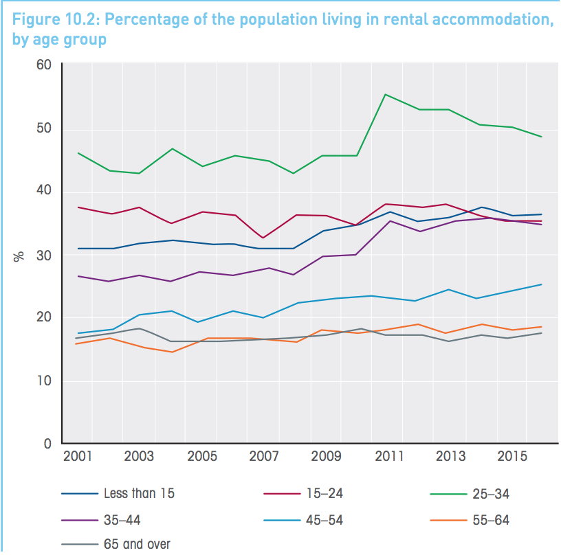
Findings from the survey show renting has declined since 2011 for the 25 to 34 age group.
“But this is not because they are more likely to be home owners, however. Rather, as with the trend for the 15 to 24 age group, it reflects the trend towards remaining in the parental home, which is often owner-occupied, until older ages,” the report said.
Over the survey period, which began in 2001 and tracks over 17,500 people across 9,500 households, the number of renters aged between 18 and 24 transitioning into home ownership has dropped massively, from 13.5 per cent down to just 7.5 per cent.
The declining rates of home ownership demonstrate the growing evidence of ‘intergenerational inequality’.
Source: HILDA survey
“There has been a growth in inequality across the generations, and this is very much tied to home ownership,” Wilkins said.
Despite this, research from Westpac shows more millennials than ever are saving up for their first property.
The data, released earlier this year, shows the highest number of first home buyer loans in March and April 2018, compared to the same period in the previous two years.
Kathryn Carpenter, Westpac’s Head of Savings, told WILLIAMS MEDIA that first home buyers are being diligent with their savings and digging deep to save for a home.
Related reading: Advice for first home buyers after new research shows most are clueless about buying property: ME Bank
“Millennials are often depicted as a generation more focused on life experiences and living in the ‘now’. However, our research shows that many are in fact taking saving for a home deposit seriously and prioritising it above other goals including travel or lifestyle,” Carpenter said.
“It is great to see our millennial customers making the most of their savings plans, and the timing could not be better with the current cooling of the property market.”
Source: HILDA survey
The research also revealed the younger end of the millennial spectrum (18-24) are already starting to save for a home.
“Our data shows reaching 25 appears to be a key tipping point for customers moving from thinking about saving for a home, to seriously saving for one”, commented Carpenter.
Dion Tolley, a real estate agent from Place Bulimba, told WILLIAMS MEDIA he has started to see more first home buyers entering the market.
“The investor market has pretty much left in the last year, given the investor squeeze from the banks, and the pressure they are putting on with lending requirements. Also with the changes to stamp duty concession at $499,000, we are definitely seeing more first home buyers entering the market along with those interest rates. As the concession has been extended for 12 months, more first home buyers are moving into the market instead of renting,” Tolley said.
“I think most people are sick of paying off investors mortgages and want to own their own homes.
“Most first home buyers typically purchase between the $350,000 to $499,000 threshold, and will typically go for the two-bedroom, two-bathroom, one car apartments. Established properties are more consistently snapped up than off the plan apartments.
“It has usually taken most of my clients who are first home buyers a couple of years to save up a decent deposit. Their parents will use the equity from their own home to tip them over that 20 per cent threshold to avoid lenders mortgage insurance because that does add on a fair whack to the weekly mortgage repayments,” he said.
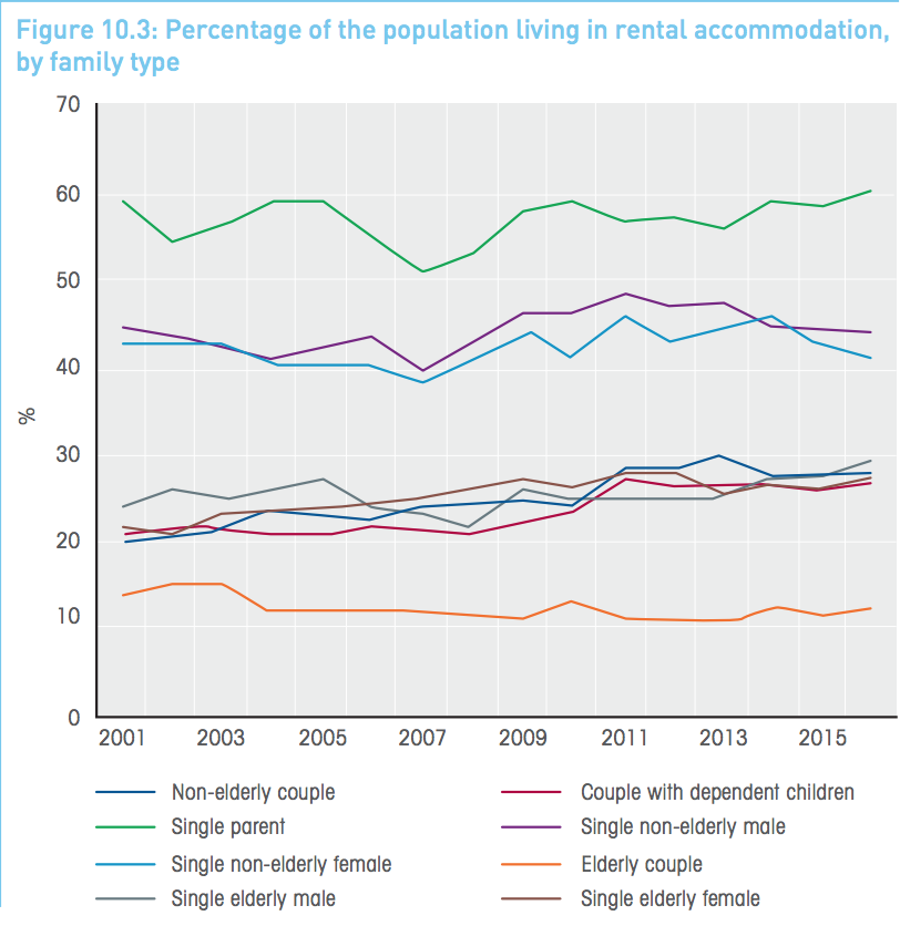
Single-parent families are experiencing a near-unprecedented level of housing stress as soaring house prices force many into unaffordable rental properties.
Analysis conducted by the Melbourne Institute as part of its annual HILDA survey revealed over 20 percent of single-parent families are stretching their budgets further than ever to keep up with annual rent rises or changes in their mortgage.
Amongst all Australians, household stress peaked at an all-time high in 2012, when 11.2 percent of all Australians were classified as having to make “unduly burdensome” mortgage repayments.
In economic terms, housing stress is technically defined as spending more than 30 percent of a household’s disposable income on housing costs, not including council rates.
In 2016, where the HILDA survey data ends, 9.6 percent of the population were experiencing housing stress.
Although single-parent families were found to be under the most dire levels of housing stress, the survey found that single elderly Australians and renters are also suffering under the weight of paying rent or covering their mortgage.
Couples without children were found to have the lowest levels of housing stress.
“Among those with housing costs, private renters have the highest rate of housing stress and owners with mortgages have the lowest rate,” wrote HILDA survey researchers.
“Moreover, over the HILDA Survey period, housing stress has increased considerably among renters—particularly renters of social housing—whereas it has decreased slightly for home owners with a mortgage.”
The survey also found that the type of home you owned or rented was directly correlated to the likelihood of having difficulty in making rent or mortgage repayments.
Australians living in apartments were found to have the highest rates of housing stress, followed by those living in semi-detached houses.
People living in separate, free-standing homes were found to have the lowest rates of housing stress – most likely because they live away from heavily-populated urban centres.
“Housing stress is generally more prevalent in the mainland capital cities, with Sydney in particular standing out,” wrote the researchers.
“However, differences across regions are perhaps not as large as one might expect given the differences in housing costs across the regions.
“Also notable is that housing stress is very high in other urban Queensland. It is only in the last sub-period (2013 to 2016) that it is not the region with the highest rate of housing stress, and even in that period only Sydney has a higher rate.”
The HILDA survey follows the lives of more than 17,000 Australians over the course of their lifetimes and published information on an annual basis on many aspects of their lives including relationships, income, employment, health and education.
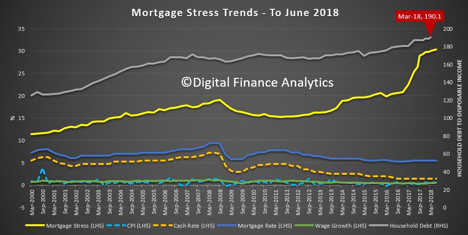
The latest findings back up analysis from Digital Finance Analytics (DFA), which estimates that more than 970,000 Australian households are now believed to be suffering housing stress.
That equates to 30.3 percent of home owners currently paying off a mortgage.
Of the 970,000 households, DFA estimates more than 57,100 families risk 30-day default on their loans in the next 12 months.
“We continue to see households having to cope with rising living costs – notably child care, school fees and fuel – whilst real incomes continue to fall and underemployment remains high,” wrote DFA principal Martin North.
“Households have larger mortgages, thanks to the strong rise in home prices, especially in the main eastern state centres, and now prices are slipping.
“While mortgage interest rates remain quite low for owner occupied borrowers, those with interest only loans or investment loans have seen significant rises.”
Precarious employment is increasing over time, and it still remains higher for women than men in Australia. But over the last nine years it has increased far more rapidly among men.
This is despite greater workforce participation and lower unemployment rates in Australia’s labour market. The quality of jobs in Australia has been declining.
In a new Bankwest Curtin Economics Centre report, we develop a composite index of precarious employment using data from the Household Income and Labour Dynamics in Australia (HILDA) survey.
The HILDA survey captures job attributes, labour force circumstances and other information about a large and representative sample of Australian workers. The index is based on 12 component indicators that capture different dimensions of precarious employment.
These include measures related to job insecurity like workers’ own views of their future employment prospects, the chance of losing their jobs, and their overall sense of job security.
We also looked at irregular hours, working fewer or more hours than desired, and a loss of work-life balance to capture the degree of control over working hours. For employment protections and other working conditions, the index uses measures related to leave entitlements including sick, family and compassionate leave.
The calculated index is centred on the average measure of precarity across all occupations and industries. Negative numbers mean lower employment precarity than the average and positives convey greater precarity. The larger the value, the more precarious the work, relative to the all-industry average.
The index shows the overall state of the economy has had a significant impact on the level of precarious employment in the labour market.
It shows levels rising for both men and women since the global financial crisis.
However, for men, precariousness is now above 2003 levels, which suggests precarious work is being driven by more than just economic conditions. And while men are still below the levels of women, the two are beginning to converge.
A major source of this trend is an increase in the self-reported probability of losing one’s job and accompanying dissatisfaction with job security.
Despite relatively stable and low levels of unemployment, workers are increasingly concerned that their jobs are at risk. The same holds true for satisfaction with job prospects, which dropped significantly since the global financial crisis and has yet to recover.
As expected, higher skilled occupations such as professionals and managers have more stable employment, while labourers and machinery operators and drivers are in the most precarious job circumstances.
Job insecurity has increased most among clerical and administrative workers and labourers, while for managers the key drivers are the loss of control over working hours and a reduction in work-life balance.
Working for government, a bank or insurance company appears to still be a relatively “safe” option. Industries with the lowest levels of precarious employment are public administration, financial and insurance services, and utilities.
By contrast, accommodation and food, agriculture, forestry and fishing, and arts and recreation services are much more precarious for their employees. Mining and to a lesser extent education have become more precarious in recent years.
Precariousness by industry and occupation
Employment precariousness, by occupation and industry.The index is centred on the overall industry average (as represented by zero). Negative numbers correspond to lower employment precarity than the average, positives convey greater precarity.
Precarious work more prevalent in some industries
There are several factors affecting the likelihood of a worker facing more or less precarious work, including the nature of the industry they are working in.
Some industry sectors, such as manufacturing, construction or mining, have a greater exposure to economic downturns or upturns, and global market forces.
Workers in the mining industry used to be among the most secure, with their sense of optimism supported by strong demand for labour during the heart of the resources boom.
But our index confirms times have changed for the sector.
Precarious work has increased in mining at a greater rate than in any other sector, driven mainly by workers’ sense of job insecurity as the sector shifts to a less labour intensive production phase, and the volatility of global resource prices.
We found employment in other sectors, in hospitality, arts and recreation, or agriculture for example, to be intrinsically more precarious by nature. These industries had irregular or uncertain hours, casual contracts, or relatively low pay.
The expanding role of technology and automation in production is another potential factor driving the growing sense of insecurity in employment, especially among lower-skilled men.
This highlights the need to ensure workers can access retraining and education opportunities that smooth their transition to new, higher skilled jobs, or into other forms of employment.
There is a shared responsibility on governments, employers, and education and training organisations to ensure that no-one is left behind.
Authors: Rebecca Cassells, Associate Professor, Bankwest Curtin Economics Centre, Curtin University; Alan Duncan, Director, Bankwest Curtin Economics Centre and Bankwest Research Chair in Economic Policy, Curtin University; Astghik Mavisakalyan, Senior Research Fellow, Curtin University; John Phillimore, Executive Director, John Curtin Institute of Public Policy, Curtin University; Yashar Tarverdi, Research fellow, Bankwest Curtin Economics Centre, Curtin University
Is inequality rising or falling? The answer, if recent public debate is anything to go by, may appear at first to depend on who you ask.
Part of the reason why we get such conflicting narratives about whether it’s rising or falling is that economic inequality can be measured in different ways, using different data sets.
And you might get a different answer depending on whether you’re talking about income inequality or wealth inequality. Income is the flow of economic resources over a certain time period, while wealth is the stock of resources built up over time.
But it doesn’t show the whole story. Combining HILDA’s results with data from the Australian Bureau of Statistics’ income surveys gives a more comprehensive picture of trends in economic inequality in Australia.
HILDA data show lower income inequality than the ABS
Firstly, you need to know that when we are talking about income, most people are referring to the disposable income of the household, not individuals.
That’s all the income that members of a household receive from various sources, minus tax. You can then then adjust for the number of people in the household, accounting for the differing needs of adults and children to get what economists call “equivalised household disposable income”.
The HILDA survey, funded by the Department of Social Services and conducted by the Melbourne Institute, has followed some 17,000 individuals every year since 2001. (The most recent ABS income survey final sample consists of 14,162 households, comprising 27,339 persons aged 15 years old and over.)
One commonly used way to measure inequality is called the Gini coefficient, which varies between zero (where all households have exactly the same income) and one (where all the income is held by only one household). The Gini coefficient for equivalised household disposable income varies between about 0.244 in Iceland to 0.397 in the United States (with most other high income OECD countries falling between these two levels), but is as high as 0.46 in Mexico and 0.57 in South Africa.
The latest HILDA report puts Australia’s Gini coefficient at 0.296 and notes that it has “remained at approximately 0.3 over the entire 15 years of the HILDA Survey.”
The HILDA surveys show a lower level of income inequality than the ABS figures do. Some of the differences between these estimates will reflect the broader definition of income used by the ABS, and the significant changes in this definition over time.
In a sense, the HILDA longitudinal survey is like a video where the same people are interviewed every year, whereas the ABS surveys are like a snapshot of the Australian population taken every two years.
But there are also problems with longitudinal surveys because participants often drop out of the survey over time. Also the survey is based on people who were living in Australia in 2001, thus leaving out immigrants who have arrived since that time. While the survey has refreshed the sample in 2011 to address this problem, this attrition may reduce the representativeness of the sample. In addition, the sample size of the ABS surveys is about 50% greater than HILDA, which will reduce sampling errors.
ABS data show inequality has risen
The Australian Bureau of Statistics (ABS) has conducted income surveys since the late 1960s, although it is only surveys since 1982 that are comprehensive and available for public analysis. These ABS surveys are also used in most of the international data sources that compare income inequality across countries – the OECD Income Distribution database and the Luxembourg Income Survey.
The ABS data show a clear increase in both wealth and income inequality over the mid- to long run.
The chart below shows two long series of estimates from the ABS surveys – those published in 2006 by researchers David Johnson and Roger Wilkins (who now oversees the HILDA survey) from 1981-82 to 1996-97, and official figures prepared by the ABS, from 1994-95 to 2013-14.
Despite the differences in income measures and equivalence scales, the long run trend from the ABS figures is clear.
There are periods in which inequality fell, but overall inequality rose over the whole period – including in the most recent period to 2013-14. The Gini coefficient in 2013-14 is a little lower than its peak just before the Global Financial Crisis, but the difference is not large.
True, there have been changes in the ABS’ survey methodology over the years but these changes should not have an effect after 2007-08, as income definitions haven’t changed in a major way since then.
Wealth is much more unequally distributed than income
The ABS also publish information on the distribution of net worth – that’s household assets minus liabilities. Wealth is much more unequally distributed than income.
According to the ABS, the Gini coefficient for net worth in 2013-14 was 0.605 (compared to a Gini coefficient for income of 0.333). This is a clear increase from a Gini of 0.573 in 2003-04.
Put another way, ABS data show a high income household in the richest 20% of the income distribution has an income around 5.4 times as high as the average household in the bottom 20% of the income distribution, as this chart demonstrates:
In contrast, ABS data show that on average households in the richest 20% of the distribution of net worth have wealth of around $2.5 million or more than 70 times higher than the net worth held on average by households in the bottom 20% of the wealth distribution, as this chart demonstrates:
Somewhat surprisingly, however, the Credit Suisse Global Wealth Report puts wealth inequality in Australia at below the world average (and the mean and median levels of net worth at among the highest in the world).
This largely reflects the still high level of home ownership in Australia and the high levels of wealth in home ownership, which accounts for nearly half of total net worth on average.
Reconciling conflicting trends
While these two major sources of data show conflicting trends on income inequality, the ABS sample size is much greater. Ultimately, however, the reasons for the differences between the findings of the ABS and the HILDA survey are not obvious.
One way forward would be for the ABS and the Melbourne Institute to jointly analyse the differences between their findings to identify why their estimates of inequality diverge.
Author: Peter Whiteford, Professor, Crawford School of Public Policy, Australian National University
Home ownership among young people is declining, as mortgage debt almost doubles for the same age group, results from the Household Income and Labour Dynamics in Australia (HILDA) survey show. It also shows young people are living with their parents longer.
The Melbourne Institute of Applied Economic and Social Research undertakes the survey every year. It’s Australia’s only nationally representative household longitudinal study, and has followed the same individuals and households since 2001.
The survey shows the rate of home ownership among 18 to 39 year olds declined from 36% in 2002 to 25% in 2014. In the same age group, the decline in home ownership has been largest for families with dependent children, falling from 56% to 39%.
Even for those in this group who manage to buy a home, mortgage debt has risen dramatically. In 2002, 89% of home owners in this age range had mortgage debt. By 2014 this had risen to 94%.
More significantly, the average home debt rose considerably. Expressed in December 2015 prices, average home debt grew from about A$169,000 in 2002 to about A$337,000 in 2014. Low interest rates since the global financial crisis have meant mortgage repayments for these home owners have remained manageable, but this group is very vulnerable to rate rises.
Detailed wealth data in the survey, collected every four years since 2002, show this increase in debt and decrease in ownership are part of a trend in the wider population. HILDA shows 65% of households were in owner-occupied dwellings in 2015, down from 69% in 2001.
In fact, the decline in home ownership has been greater than the decline in owner-occupied households. This is largely because adult children are living with their parents for longer.
For example, the HILDA data show that the proportion of women aged 22 to 25 living with their parents rose from 28% in 2001 to 48% in 2015. For men this proportion rose from 42% to 60%.
Among those who manage to access the housing market, the data shows that the growth in home debt is not simply because they are borrowing more to purchase their home. A surprisingly high proportion of young home owners (between 30% and 40%) actually increase their debt from one year to the next, despite most of them remaining in the same home. Even over a four-year period – for example, from 2010 to 2014 – at least 40% of young home owners with a mortgage increase their nominal home debt.
The proportion of people with home debt that exceeds the value of their home – that is, negative equity – has also risen. In 2002, 2.4% of people had negative equity in their home; in 2014, 3.9% had negative equity. This is a relatively small proportion, but this could change as even small decreases in house prices will result in substantial increases in the prevalence of negative equity.
How this changes with location, income and profession
In 2014, less than 20% of Sydneysiders aged 18 to 39 were home owners, compared with 36% or more in the ACT, urban Northern Territory and non-urban regions of Australia. To a significant extent this reflects differences across regions in house prices.
Sydney and Melbourne have particularly high house prices, while non-urban areas generally have comparatively low house prices. Regional differences in the incomes of 18 to 39 year olds also play a role.
Those with the highest home-ownership rates are professionals and, to a lesser extent, managers. They experienced relatively little decline in home ownership.
For workers in other occupations, home ownership has declined substantially. In 2014 home ownership was especially rare among community and personal services workers, sales workers and labourers.
This decline represents profound social change among this age group, where renting is increasingly becoming the dominant form of housing. In 2002, 61% of people aged 35 to 39 were home owners – a clear majority of their age group. By 2014, this proportion had fallen to 48%.
The changing housing situation of young adults is part of a broader change in the distribution of wealth in Australia. The HILDA Survey shows that differences in average wealth by age have grown since 2002. For example, in 2002, median net wealth of those aged 65 and over was 2.8 times that of people aged 25 to 34. In 2014, this ratio had increased to 4.5.
The decline in home ownership among young adults and this broader trend in wealth have implications for their long-term economic wellbeing and indeed for the retirement income system. Even if house price growth moderates and many of those currently aged under 40 ultimately enter the housing market, it’s likely that a rising proportion will not have paid off the mortgage by the time they retire. It may be that many will resort to drawing on superannuation balances to repay home loans, in turn increasing demands on the Age Pension.
Author: Roger Wilkins, Professorial Research Fellow and Deputy Director (Research), HILDA Survey, Melbourne Institute of Applied Economic and Social Research, University of Melbourne