
Following the initial release yesterday, and the coverage in the AFR, today we drill down further into the latest mortgage stress results.
By way of background, we have been tracking stress for years, and in 2014 we set out the approach we use. Other than increasing the sample, and getting more granular on household finance, the method remains the same, and consistent. We can plot the movement of stress over time.
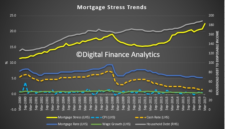 Remember that the recent RBA Financial Stability review revealed that 30% of households were under pressure with no mortgage buffer, and a recent Finder.com.au piece suggested more than 50% were unable to cope with a $100 a month rise. So we are not alone in suggesting households are under greater financial pressure.
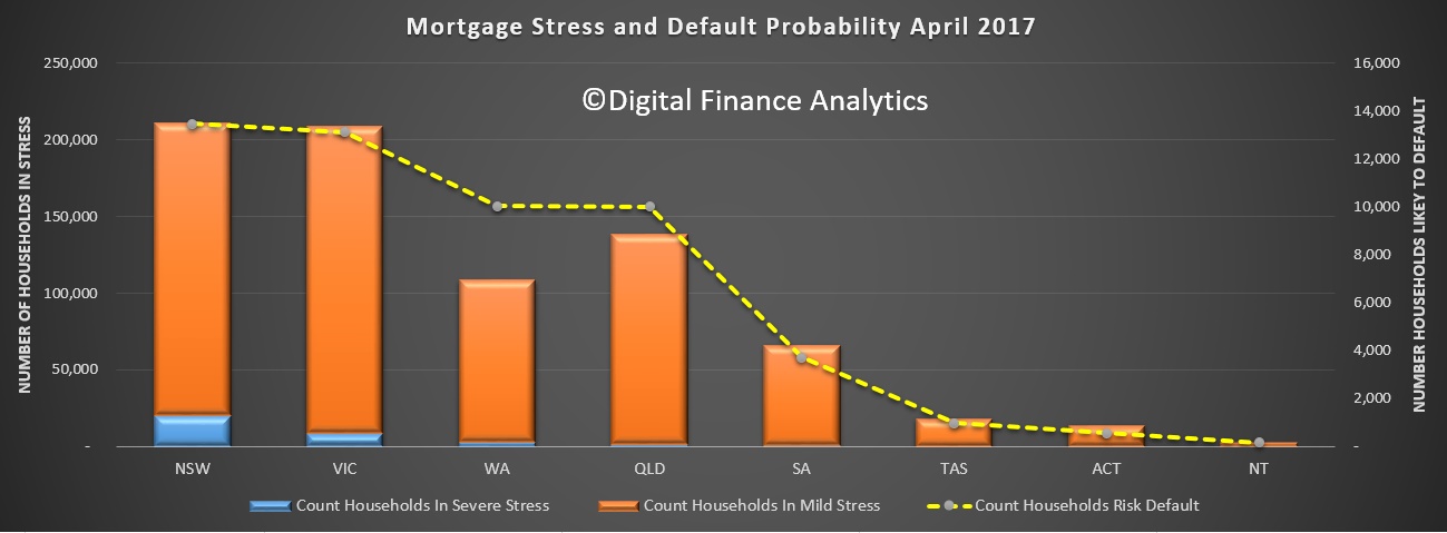
For this analysis we plot the number of households in mild stress (making mortgage repayments on time but tightening their belts so to do); severe stress (insufficient cash flow to pay the mortgage), and also an estimation of the number of households who may hit a 30-day default within the next 12 months. This is calculated by adding in a range of economic overlays into the stress data. This is all done in our core market model, which contains data from our rolling surveys, private data from lenders and other sources, and public data from the RBA, APRA and ABS. This model is unique in the Australian context because it runs at a post code and household segment level, allowing us to drill into the detail. This is important because averaging masks significant variations.
The analysis shows that there are more severely stressed households in NSW than other states, and that around 13,000 households risk default in the next year, a similar number to VIC. WA is third on this list, with the number of defaults lower elsewhere.
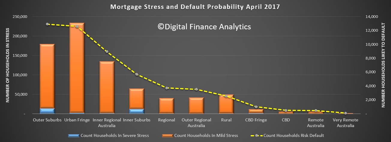
 Another lens is by the locations of households, in the residential zones around our major cities. The highest risk of default resides in the our suburbs, where a higher proportion of households are in severe stress. Households in inner regional Australia are next, followed by the inner suburbs, where again more households are in severe stress.
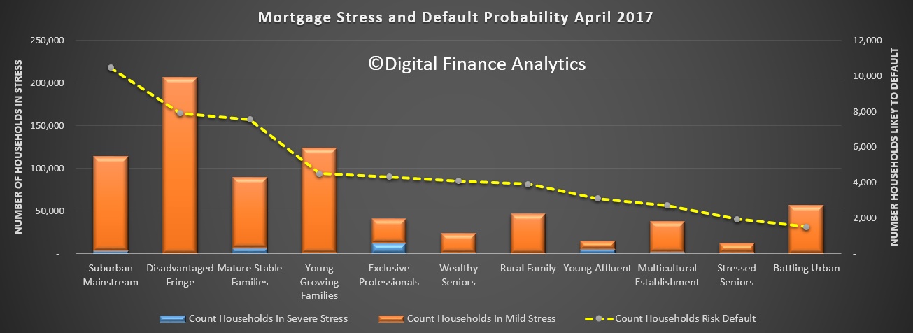
 Our core household segmentation shows that the highest count of defaults are likely among the suburban mainstream, then the disadvantaged fringe, followed by mature stable families and young growing families. It is also worth noting that the young affluent and exclusive professional, the two most affluent segments contain a number of severe stressed households. This have larger mortgages and lifestyles, but not necessarily more available cash.
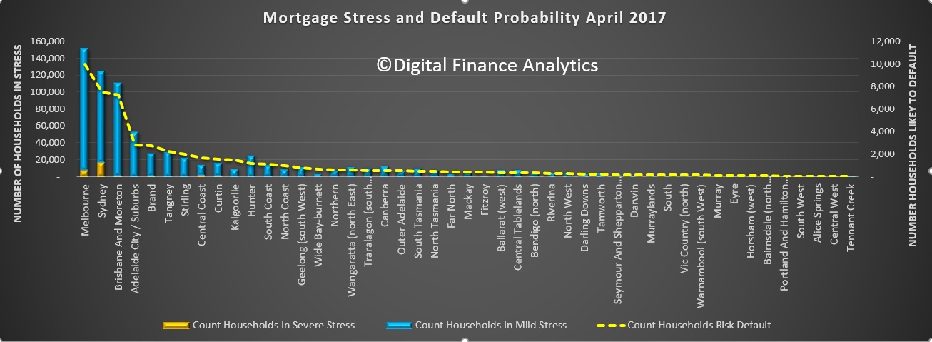
 Finally, for today, here is the mapping across the regions. No surprise that the largest number of stressed households are in the main urban centres of Melbourne and Sydney.
 Next time we will look at post codes across the country.
One thought on “What The Mortgage Stress Data Tells Us”