US weekly earnings increase 4.2 percent

According to the US Bureau of Statistics, weekly earnings of the nation’s 110.7 million full-time wage and salary workers were $865 (not seasonally adjusted) in the first quarter of 2017, an increase of 4.2 percent from a year earlier ($830).

From the first quarter of 2016 to the first quarter of 2017, median usual weekly earnings increased 4.2 percent for men who usually worked full time and 2.0 percent for women. In the first quarter of 2017, women who usually worked full time had median weekly earnings of $765, or 80.5 percent of the $950 median for men.

Among the major race and ethnicity groups, median weekly earnings for full-time wage and salary workers were $894 for Whites in the first quarter of 2017, $679 for Blacks or African Americans, $1,019 for Asians, and $649 for workers of Hispanic or Latino ethnicity.

These data are from the Current Population Survey.

Deutsche Bank Fined For Rigging FX Trading

The US Federal Reserve has announced two enforcement actions against Deutsche Bank AG that will require bank to pay a combined $156.6 million in civil money penalties.

The Federal Reserve on Thursday announced two enforcement actions against Deutsche Bank AG that will require the bank to pay a combined $156.6 million in civil money penalties. The bank will pay a $136.9 million fine for unsafe and unsound practices in the foreign exchange (FX) markets, as well as a $19.7 million fine for failure to maintain an adequate Volcker rule compliance program prior to March 30, 2016.

In levying the FX fine on Deutsche Bank, the Board found deficiencies in the firm’s oversight of, and internal controls over, FX traders who buy and sell U.S. dollars and foreign currencies for the organization’s own accounts and for customers. The firm failed to detect and address that its traders used electronic chatrooms to communicate with competitors about their trading positions. The Board’s order requires Deutsche Bank to improve its senior management oversight and controls relating to the firm’s FX trading.

The Board is also requiring the firm to cooperate in any investigation of the individuals involved in the conduct underlying the FX enforcement action and is prohibiting the organization from re-employing or otherwise engaging individuals who were involved in this conduct.

Separately, the Board found gaps in key aspects of Deutsche Bank’s compliance program for the Volcker rule, which generally prohibits insured depository institutions and any company affiliated with an insured depository institution from engaging in proprietary trading and from acquiring or retaining ownership interests in, sponsoring, or having certain relationships with a hedge fund or private equity fund.

The Board also found that the firm failed to properly undertake certain required analyses concerning its permitted market-making related activities. The consent order requires Deutsche Bank to improve its senior management oversight and controls relating to the firm’s compliance with Volcker rule requirements.

US CPI rose 2.4 percent over the 12 months ending March 2017

The US Bureau of Labor Statistics says from March 2016 to March 2017, the Consumer Price Index for All Urban Consumers (CPI-U) all items index rose 2.4 percent. This was smaller than the 2.7-percent rise for the year ending February 2017. The index for all items less food and energy rose 2.0 percent over the past year, the smallest 12-month increase since November 2015. The energy index rose 10.9 percent over the year, while the food index increased 0.5 percent.

These data are from the BLS Consumer Price Index program and are not seasonally adjusted.

A Profile of the Working Poor, 2015

In 2015, according to the U.S. Census Bureau, about 43.1 million people, or 13.5 percent of the nation’s population, lived below the official poverty level.

Although the poor were primarily children and adults who had not participated in the labor force during the year, 8.6 million individuals were among the “working poor” in 2015, according to data from the Bureau of Labor Statistics; the 8.6 million figure was down from 9.5 million in 2014. The working poor are people who spent at least 27 weeks in the labor force (that is, working or looking for work) but whose incomes still fell below the official poverty level. In 2015, the working-poor rate—the ratio of the working poor to all individuals in the labor force for at least 27 weeks—was 5.6 percent, 0.7 percentage point lower than the previous year’s figure.

Following are some highlights from the 2015 data:

  • Full-time workers continued to be much less likely to be among the working poor than were part-time workers. Among persons in the labor force for 27 weeks or more, 3.4 percent of those usually employed full time were classified as working poor, compared with 14.1 percent of part-time workers.
  • Women were more likely than men to be among the working poor. In addition, Blacks and Hispanics continued to be more than twice as likely as Whites and Asians to be among the working poor.
  • The likelihood of being classified as working poor diminishes as workers attain higher levels of education. Among those with less than a high school diploma, 16.2 percent of those who were in the labor force for at least 27 weeks were classified as working poor, compared with 1.7 percent of college graduates.
  • Individuals who were employed in service occupations continued to be more likely to be among the working poor than those employed in other major occupational groups.
  • Among families with at least one member in the labor force for 27 weeks or more, those with children under 18 years old were about 5 times as likely as those without children to live in poverty. Families maintained by women were almost twice as likely as families maintained by men to be living below the poverty level.

chart 1

Demographic characteristics

Among those who were in the labor force for 27 weeks or more in 2015, the number of women classified as working poor (4.5 million) was higher than that of men (4.1 million). The working-poor rate also continued to be higher for women (6.3 percent) than for men (5.0 percent). The working-poor rates for both women and men were down from a year earlier.

Blacks and Hispanics were more than twice as likely as Whites and Asians to be among the working poor. In 2015, the working-poor rates of Blacks and Hispanics were 11.2 percent and 10.1 percent, respectively, compared with 4.8 percent for Whites and 4.1 percent for Asians.

Chart2

US Industrial production increased 0.5 percent in March

Industrial production increased 0.5 percent in March after moving up 0.1 percent in February according to the US Federal Reserve.

The increase in March was more than accounted for by a jump of 8.6 percent in the output of utilities—the largest in the history of the index—as the demand for heating returned to seasonal norms after being suppressed by unusually warm weather in February.

Manufacturing output fell 0.4 percent in March, led by a large step-down in the production of motor vehicles and parts; factory output aside from motor vehicles and parts moved down 0.2 percent. The production at mines edged up 0.1 percent. For the first quarter as a whole, industrial production rose at an annual rate of 1.5 percent.

At 104.1 percent of its 2012 average, total industrial production in March was 1.5 percent above its year-earlier level.

Capacity utilization for the industrial sector increased 0.4 percentage point in March to 76.1 percent, a rate that is 3.8 percentage points below its long-run (1972–2016) average.

What Is the Informal Labor Market?

From The St.Louis Fed On The Economy Blog.

Although often associated with developing countries, illicit activities or undocumented workers, the informal labor market is much broader than many would imagine. In fact, people from all walks of life participate in a wide array of legitimate business ventures that are part of the informal economy. So, how big is the U.S.’s informal labor market, and who participates in it?

What Is the Informal Labor Market?

There is no unique definition for informal employment. However, a generally accepted way to define it is by considering individuals (and their employers) who engage in productive activities that are not taxed or registered by the government.1

Though this type of work has always existed—picture the fruit vendor at the farmers’ market who only accepts cash for payment—the expansion of online platforms that facilitate these arrangements has increased their visibility and fueled their popularity.

Measuring the Informal Labor Market

Numerous surveys have surfaced lately in an effort to better understand the fringes of the U.S. labor market. Though methodologies differ (as do the specific questions these surveys attempt to answer), comparing the results helps shine a light on the sometimes elusive nature of the informal labor market.

Survey of Informal Work Participation

For example, the Survey of Informal Work Participation within the Survey of Consumer Expectations revealed that about 20 percent of non-retired adults at least 21 years old in the U.S. generated income informally in 2015.2 The share jumped to 37 percent when including those who were exclusively involved in informal renting and selling activities.

When breaking down the results by the Bureau of Labor Statistics (BLS) employment categories, about 16 percent of workers employed full time participated in informal work. Not surprisingly, the highest incidence of informal work was among those who are employed part time for economic reasons, with at least 30 percent participating in informal work. Also, at least 15 percent of those who are considered not in the labor force by the BLS also participated in informal work.

Enterprising and Informal Work Activities Survey

Another example is the Enterprising and Informal Work Activities (EIWA) survey, which revealed that 36 percent of adults in the U.S. (18 and older) worked informally in the second half of 2015.3 Of these informal workers, 56 percent self-identified as also being formally employed, and 20 percent said they worked multiple jobs (including full-time and part-time positions).

Survey Differences

The difference in methodologies between these two surveys is clear simply from looking at the basic results. Despite pointing in similar directions, the results on the extent of the informal labor market cannot be directly compared to each other. But when we look at the demographic breakdown of contingent and informal workers, the results are quite consistent.

The EIWA survey showed that informal workers were distributed across all income categories. For example:

  • 30 percent of respondents reported having an annual income of $100,000 or greater.
  • 18 percent reported earning less than $25,000.

There were slightly more women than men among informal workers, though the share of women was much larger in lower income categories.

The majority of informal workers were white, non-Hispanic (64 percent), while the share of Hispanic workers tended to be slightly higher than that of African-Americans (16 and 12 percent, respectively). The racial breakdowns were consistent across most income categories, with a higher incidence of informal work among minorities in the lowest income categories.

Finally, most informal workers had at least a college degree (31 percent) or some college (30 percent), but high school graduates were also a sizeable share (26 percent).4

Impact on the Labor Market as a Whole

Capturing the extent of the informal labor market in the U.S. may help improve the measures of employment and labor market slack, as well as better measure the effects that informal employment activities have on the U.S. economy.

Moreover, it would help improve policies to incentivize workers in the informal sector to participate fully in the formal sector and by consequence take advantage of benefits that are in place for formal-sector jobs.

Notes and References

1 Demetra Smith Nightingale and Stephen Wandner provide other definitions of informal employment and associate different types of workers with the formality of their employment arrangements. See Smith Nightingale, Demetra and Wandner, Stephen A. “Informal and Nonstandard Employment in the United States: Implications for Low-Income Working Families.” The Urban Institute, Brief 20, August 2011.

2 See Bracha, Anat and Burke, Mary A. “Who Counts as Employed? Informal Work, Employment Status, and Labor Market Slack.” Federal Reserve Bank of Boston Working Paper No. 16-29, December 2016.

3 See Robles, Barbara and McGee, Marysol. “Exploring Online and Offline Informal Work: Findings from the Enterprising and Informal Work Activities (EIWA) Survey.” Finance and Economics Discussion Series 2016-089. Washington: Board of Governors of the Federal Reserve System, October 2016.

4 Appendix D in Robles and McGee (2016) shows these demographic characteristics are consistent across different surveys.

Credit Cycle Enjoys a Respite

From Moody’s

For the first time since 1987-1988, the US credit cycle has stabilized following a surge by credit rating downgrades relative to upgrades, a jump by the high-yield default rate, and a pronounced widening by corporate bond yield spreads. After six years at 49% of US high-yield credit rating revisions from July 2009 through June 2015, downgrades soared to 71% in the year-ended June 2016. Then downgrades eased to 58% for the year-ended March 2017 and sank to 48% during Q1-2017.

The much reduced relative incidence of downgrades was joined by a drop for the forward-looking high-yield EDF (expected default frequency metric from February 2016’s current recovery high of 8.1% to a recent 3.7% and a narrowing by the high-yield bond spread from February 2016’s nearly eight-year high of 839 bp to a recent 412 bp. In addition, after peaking at January 2017’s 5.9%, the US high-yield default rate has eased to March’s 4.7% and is projected to average 3.1% during 2017’s final quarter.

Market expects profits to again outpace corporate debt

The deterioration of high-yield credit rating revisions comparing the six years ended June 2015 with the year ended June 2016 was linked to a dramatically different performance by nonfinancial-corporate profits from current production. After having advanced by 9.8% annually, on average, during the six years ended June 2015, profits from current production contracted by -9.2% annually during the year ended June 2016. The loss of financial flexibility to the shrinkage of profits was made worse by an acceleration of nonfinancial-corporate debt from the 2.5% average annualized rise of the six-years-ended June 2015 to the 6.8% year-over-year increase of the following 12 months. (Figure 1.)

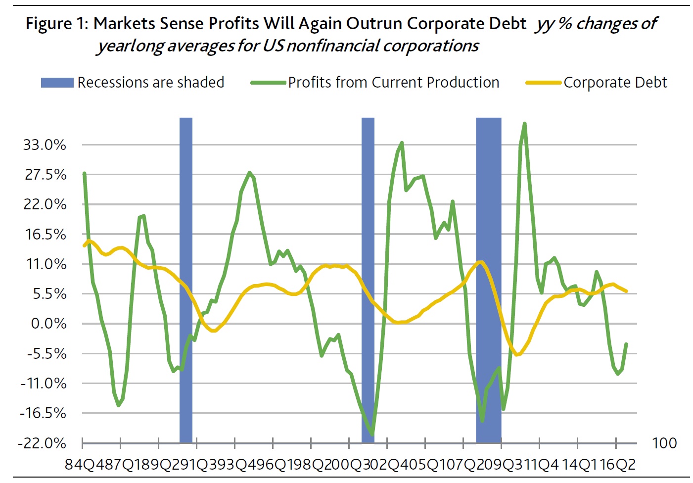
Few broad-based trends weaken corporate credit quality more than the simultaneous contraction of earnings and expansion of debt. To the contrary, the faster growth of profits vis-a-vis debt typically lessens default risk significantly.

Fourth-quarter 2016 showed a narrowing of debt’s faster expansion vis-a-vis profits. For the first time since Q1-2015’s year-to-year increase of 12.0%, Q1-2017’s profits from current production managed to grow from a year earlier by 3.0%. Previously, this measure of profits had contracted annually in each of the six quarters ended Q3-2016 by -7.0%, on average, which had been joined by an accompanying 6.8% average yearly increase for corporate debt. Though Q4-2016’s 5.2% annual increase by corporate debt still outran profits’ 3.0% rise, at least it occurred in the context of profits growth, as well as slowing noticeably from when profits shrank.

Credit often gets pummeled when profits shrink while debt grows

The last two times a year-long contraction by profits was accompanied by an acceleration of corporate debt, the imbalance eventually inflicted heavy damage on corporate credit. The two earlier episodes commenced in Q2-2007 and Q1-1998.

Ultimately, corporate bond yield spreads ballooned and the high-yield default rate climbed sharply higher. The high-yield bond spread swelled from the 283 bp of Q2-2007 and the 338 bp of Q1-1998 to cycle highs of 1,678 bp for Q4-2008 and 971 bp for Q4-2002. In addition, the default rate soared from Q2-2007’s 1.5% and Q1-1998’s 2.5% to cycle highs of 14.5% for Q4-2009 and 10.9% for Q1-2002.

Credit survived mid-1980s drop by profits amid rapid debt growth

However, when corporate debt’s moving year-long average outran comparably measured profits beginning with Q2-1985 and ending in Q3-1987, both spread widening and the climb by the default rate were much more limited compared to 2007 and 1998. Better yet, unlike 1998 and 2007, 1986’s simultaneous contraction of profits and expansion of debt did not eventually lead to a recession.

Markets now sense that the 2015-2016 bout of brisk debt growth amid shrinking profits will mimic what transpired in the mid-1980s and, thus, will be succeeded by a profits recovery that outpaces corporate debt. That is exactly what occurred from Q4-1987 through Q4-1988, when profits’ 15.0% annualized advance well outran the still lively 10.3% annualized growth of corporate debt.

Nevertheless, the 1987-1988 reprieve was short lived. By year-long 1989, the unfavorable imbalance returned, as profits contracted by -6.9% annually while corporate debt grew by +9.6%.

The experience of the mid- to late-1980s warns against becoming too optimistic if, as the market implicitly expects, profits again outrun debt by late 2017. By itself, the current upturn’s maturity suggests that pent-up demand has been mostly depleted. For example, despite the most attractive auto sales incentives since 2009, unit sales of light motor vehicles fell from a year earlier in 2017’s first quarter. Elsewhere, a growing number of retail chains struggle with lower than expected sales.

The pace of home sales during housing’s peak selling season of March through June will provide critical insight regarding the health of domestic expenditures. If home sales unexpectedly stall, profits may be incapable of outpacing corporate debt, which would widen spreads significantly and worsen the now benign outlook for defaults. Comparably to what transpired in the 1980s, corporate credit’s current reprieve may not last much longer than a year. And that would be especially true if short- and long-term interest rates rose to heights that are too burdensome for financial markets and business activity.

High-yield downgrades eclipse upgrades when focusing on fundamentals
The US high-yield credit rating revisions of 2017’s first quarter showed the most upgrades relative to downgrades since 2014’s third quarter. A preliminary count revealed 89 upgrades and 83 downgrades. However, the accompanying revisions of investment-grade ratings showed three more downgrades (17) than upgrades (14).

It is important to note that not all rating revisions are the consequence of changed fundamentals. For example, some rating revisions stem from changes in creditor protection owing to the issuance of new debt. Other revisions not viewed as fundamentally driven include stand-alone special-events such as mergers, acquisitions, divestitures, equity buybacks, special dividends, and infusions of common equity capital.

Whenever fundamentals and special events simultaneously trigger a rating revision, the rating change is tallied as driven by fundamentals. Only when the influence of fundamentals is viewed as negligible is the revision deemed to be for some other reason.

Recognizing the impossibility of establishing unequivocally that a rating change was due only to fundamentals, fundamentals appear to have been responsible for 54 of Q1-2017’s high-yield upgrades and 59 of the high-yield downgrades. Thus, when considering only rating changes caused by fundamental drivers, Q1-2017 was home to more high-yield downgrades than upgrades.

The first-quarter 2017 upgrade share of high-yield credit rating changes fell from 52% to 48% after limiting the sample to fundamentally-driven revisions. Fundamentals last figured in more high-yield upgrades than downgrades in 2014’s third quarter, or when non-financial corporations posted lively year-to-year advances of 5.8% for gross-value-added and 11.3% for profits from current production, as the high-yield spread averaged a thin 376 bp.

Comparable revenue and earnings results for 2017’s first quarter are not yet available, though the consensus looks for implied year-long 2017 gains of 4.3% for gross-value-added and 5.0% for pretax operating profits. First-quarter 2017’s high-yield bond spread of 397 bp was much thinner than the 477 bp of Q4-2016, or when upgrades’ share of high-yield rating changes fell from 32% overall to just 27% when limited to fundamentals.

A switch to the opposite direction held for investment-grade revisions, too, where the 11 upgrades led the eight downgrades when limiting the sample to fundamentally driven rating changes. Mergers and acquisitions (M&A) figured in nine of the 17 investment-grade downgrades, but entered into fewer three of the group’s 14 upgrades.

No longer do the problems of the oil & gas industry skew the number of downgrades higher. In Q1-2017, the oil & gas industry figured in 12 upgrades and 12 downgrades — 11 apiece for high-yield and one each for investment grade. Ample liquidity and firmer energy prices account for why the frequency of oil & gas-related high-yield rating revisions improved from the per quarter averages of four upgrades and 57 downgrades from the year-ended June 2016.

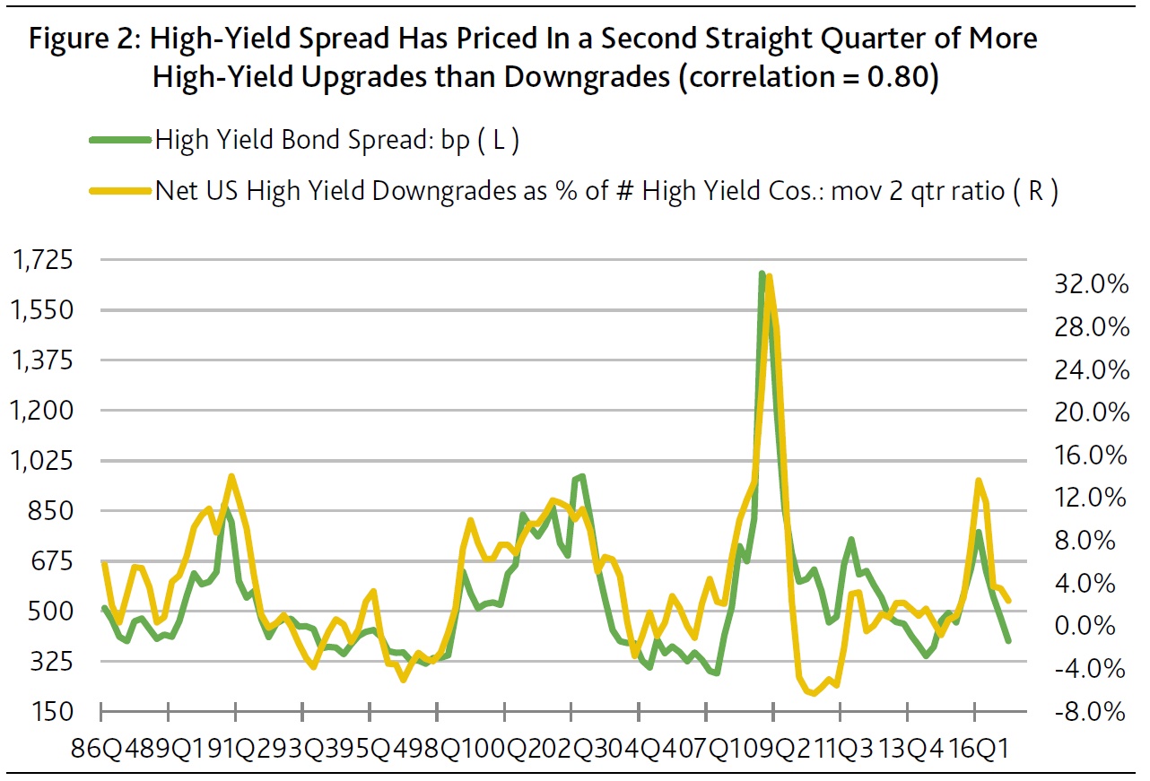
Recent high-yield spread implies the market expects more upgrades than downgrades

As derived from a sample that commences with 1986’s final quarter, the quarter-long average of the US high-yield bond spread generates a relatively strong correlation of 0.80 with the moving two-quarter ratio of net high-yield downgrades as a percent of the number of high-yield issuers. Net high-yield downgrades, or the difference between the number of downgrades less upgrades, fell from Q4-2016’s +53 to Q1-2017’s -6. In turn, the moving two-quarter ratio of net high-yield downgrades dipped from Q4-2016’s 3.6% to Q1-2017’s 2.4% of the number of high-yield issuers.

The narrowing of the high-yield bond spread from the 551 bp of Q4-2016 to Q1-2017’s 477 bp was qualitatively consistent with the accompanying drop by the relative incidence of net downgrades. First-quarter 2017’s moving two-quarter net downgrade ratio was the lowest since the 1.0% of 2015’s second quarter, or when the high-yield spread averaged 462 bp. When the net downgrade ratio last peaked at Q1-2016’s 13.7%, the high-yield spread averaged a very wide 776 bp. (Figure 2.)

If high-yield downgrades equal upgrades over a two-quarter span, the long-term statistical relationship predicts a midpoint of 436 bp for the high-yield bond spread. Thus, the recent high-yield spread of 412 bp implicitly expects that upgrades will outnumber downgrades for a second straight quarter in Q2-2017.

Steepening yield curve a risk for long-dated bonds

From Investor Daily.

Australian fixed income investors should focus on shorter-dated bonds as the US Treasury yield curve begins to steepen, says FIIG Securities.

The minutes from the most recent meeting of the US Federal Open Markets Committee suggests the Federal Reserve is likely to commence unwinding its quantitative easing programs, which will result in “a reduction in the quantity of bonds and mortgage backed securities held on the Federal Reserve’s balance sheet”, FIIG Securities said.

The firm cautioned that even if this process is well signaled by the Federal Reserve, it will likely lead to a steepening of the yield curve and a subsequent sell-off of long duration bonds.

“The Fed is a significant investor in US Treasury markets and if they do start to reduce holdings – most likely through non re-investment of coupon and principal redemptions – it is likely to lead to a steeper yield curve as demand for US Treasury bonds will necessarily fall,” FIIG Securities said.

“This is a de facto tightening of monetary policy and, in 2018 alone, would amount to an extra US$425 billion.”

Much like the ‘Taper Tantrum’ which followed former Federal Reserve chair Ben Bernanke’s signaling of an end to quantitave easing in 2013, the rise in US Treasury yields would likely carry through to Australian dollar denominated assets.

“Indeed, over the last month the AUD yield curve has rallied strongly (yields lower, prices higher), which could exacerbate the problem,” FIIG Securities said.

The firm said that while not all longer duration bonds will be negatively affected, investors must think about how they’re positioned to handle the steepening yield curve.

“Long-dated bonds with high credit margins have historically performed better in an environment where benchmark yields rise, due to those margins contracting,” FIIG Securities said.

“Holders of some longer-dated bonds … can take some comfort from this, but should nevertheless consider their interest rate exposure.”

US Unemployment Rate was 4.5 percent in March

According to the US Bureau of Labor Statistics, the unemployment rate was 4.5 percent in March 2017. The last time the unemployment rate was 4.5 percent was during the first half of 2007.

The March unemployment rate of 4.5 percent resulted from there being 7.2 million unemployed people among the 160.2 million people in the labor force. People were counted as unemployed if they did not work for pay during the week that included March 12, had actively sought employment during the preceding 4 weeks or were waiting to be recalled from a temporary layoff, and could have started a job if they had received an offer of employment. The labor force is the sum of employed and unemployed people.

BLS publishes six “alternative measures of labor underutilization,” known as U-1 through U-6, in each month’s Employment Situation news release. The unemployment rate, also called U-3, is the total number of unemployed people as a percentage of the labor force. U-1 and U-2 are more narrowly defined and always lower than the U-3 rate. U-4, U-5, and U-6 are more broadly defined and always higher.

In March 2017, the narrower measures, U-1 and U-2, were 1.7 percent and 2.2 percent, respectively. U-1 includes only people who were unemployed for 15 weeks or longer. U-2 includes only unemployed people who lost their jobs or completed temporary jobs.

The most broadly defined rate, U-6, includes unemployed people, plus people who are “marginally attached” to the labor force, plus people who work part time for economic reasons. The marginally attached are neither working nor looking for work but want and are available for a job and have looked for work sometime in the past 12 months. People who work part time for economic reasons are those that would have preferred full-time employment, but were working part time because their hours had been cut or because they were unable to find a full-time job. The U-6 rate was 8.9 percent in March 2017. Before that, it was most recently below 9.0 percent in December 2007.

These data are from the Current Population Survey and are seasonally adjusted. To learn more, see “The Employment Situation — March 2017” (HTML) (PDF). Also see charts from the Employment Situation data.


Generation Rent

A report by AMP says a major demographic shift in the US has contributed to a steady decline in home ownership since the Global Financial Crisis (GFC), with Generation Y dubbed Generation Rent as millennials delay purchasing a home in the suburbs in favour  of renting in the urban core.

A new AMP Capital whitepaper, Generation Rent, explores this trend, the  implications for real estate investors and the opportunities within the US apartment REIT sector.

AMP Capital Client Portfolio Manager for Global Listed Real Estate and report author Chris  Deves said: “The greater propensity for millennials to rent isn’t necessarily a surprise.  After all, this is the same generation that pioneered the ‘sharing economy’, a collaborative approach to consumption, which draws heavily  on the notion of renting.

“Millennials are opting for proximity to nightlife, restaurants and the workplace along with  access to shared spaces and amenities, which is translating into greater demand for rented apartments in the urban core.  As a demographic cohort, the  strong willingness of millennials to relocate in the pursuit of new career  opportunities necessitates flexibility and mobility, which is also more  conducive to renting over owning.”

The paper shows this is an important tailwind for US apartment REITs, which  make up roughly 8 per cent of the global listed real estate benchmark or more  than US$100 billion of equity market capitalisation.

“On a  through-cycle basis, this shift is a positive for residential landlords and, in  turn, a positive for investors in the listed institutional apartment operators,  which have asset portfolios with meaningful exposure to key urban centres.

“Apartment  REITs are generally high quality and consolidation in the sector has left a set  of large, well-capitalised companies with seasoned management teams, making  them attractive for real estate investors with a long-term investment horizon,”  Mr Deves said.

Mr Deves notes that millennials won’t, however, rent forever.  He said: “The  American dream of home ownership is not dead and buried.  Gen Y are just  as likely to head for the suburbs as previous generations, and starting a  family is often an important catalyst.  The key difference is that we are  seeing this occur increasingly later in life.

“Cyclical affordability issues and demographic change has and will support demand for  apartment rentals in city centres.  During the property cycle, the US  apartment REITs should therefore be in a stronger position to push rents, and quality management teams with insight into the needs of millennials will be  best placed to deliver value for investors of all sizes.”

While the story is similar for Australian millennials, investing in the US is the best way to play this trend for local investors as it offers the largest, highest quality, and most liquid set of listed apartment landlords.

Mr Deves said: “Australian investors should consider a global strategy for listed real  estate in order to access these kinds of thematics, which may not be as readily  investible in their local market.  A global approach also offers geographic diversification for the real estate portfolio.”