The Financial Challenges of Small Businesses

From “On The Economy Blog”

More than 60 percent of small businesses faced financial challenges in the past year, according to the USA 2016 Small Business Credit Survey.

The survey, which was a collaboration of all 12 Federal Reserve banks, provides an in-depth look at small business performance and debt. This report focuses on employer firms, or those with at least one full- or part-time employee.1 When looking at the financial challenges of small businesses, the report covered the second half of 2015 through the second half of 2016.

Financial Challenges and How They Were Addressed

Among all firms, 61 percent reported facing financial challenges over this time period. Financial challenges included:

  • Credit availability or securing funds for expansion
  • Paying operating expenses
  • Making payments on debt
  • Purchasing inventory or supplies to fulfill contracts

Firms with smaller annual revenue were more likely to experience financial challenges. Of firms with $1 million or less, 67 percent reported facing financial challenges, compared to only 47 percent of firms with more than $1 million.

The figure below shows the breakdown of which financial challenges were most prevalent among small businesses.

financial challenges

The survey also asked small businesses how they addressed these issues. Their responses are captured in the figure below. (It should be noted that respondents could also answer “unsure” and “other,” and those responses are not captured below.)

small business actions

Notes and References

1 This does not include self-employed or firms where the owner is the only employee.

US Employment Data Mixed In May

According to the US Bureau of Labor Statistics, total nonfarm payroll employment increased by 138,000 in May, and the unemployment rate was little changed at 4.3 percent. Job gains occurred in health care and mining. The labor force participation rate declined by 0.2 percentage point to 62.7 percent.

The unemployment rate, at 4.3 percent, and the number of unemployed persons, at 6.9 million, changed little in May. Since January, the unemployment rate has declined by 0.5 percentage point, and the number of unemployed has decreased by 774,000.

Among the unemployed, the number of job losers and persons who completed temporary jobs declined by 211,000 to 3.3 million in May. The number of long-term unemployed (those jobless for 27 weeks or more) was essentially unchanged over the month at 1.7 million and accounted for 24.0 percent of the unemployed.

The labor force participation rate declined by 0.2 percentage point to 62.7 percent in May but has shown no clear trend over the past 12 months. The employment-population ratio edged down to 60.0 percent in May.

The number of persons employed part time for economic reasons (sometimes referred to as involuntary part-time workers) was little changed at 5.2 million in May. These individuals, who would have preferred full-time employment, were working part time because their hours had been cut back or because they were unable to find a full-time job.

In May, 1.5 million persons were marginally attached to the labor force, down by 238,000 from a year earlier. (The data are not seasonally adjusted.) These individuals were not in the labor force, wanted and were available for work, and had looked for a job sometime in the prior 12 months. They were not counted as unemployed because they had not searched for work in the 4 weeks preceding the survey.

Among the marginally attached, there were 355,000 discouraged workers in May, down by 183,000 from a year earlier. (The data are not seasonally adjusted.) Discouraged workers are persons not currently looking for work because they believe no jobs are available for them. The remaining  1.1 million persons marginally attached to the labor force in May had not searched for work for reasons such as school attendance or family responsibilities.

Establishment Survey Data

Total nonfarm payroll employment increased by 138,000 in May, compared with an average monthly gain of 181,000 over the prior 12 months. In May, job gains occurred in health care and mining.

Employment in health care rose by 24,000 in May. Hospitals added 7,000 jobs over the month, and employment in ambulatory health care services continued to trend up (+13,000). Job growth in health care has averaged 22,000 per month thus far in 2017, compared with an average monthly gain of 32,000 in 2016.

Mining added 7,000 jobs in May. Employment in mining has risen by 47,000 since reaching a recent low point in October 2016, with most of the gain in support activities for mining.

In May, employment in professional and business services continued to trend up (+38,000). The industry has added an average of 46,000 jobs per month thus far this year, in line with the average monthly job gain in 2016.

Employment in food services and drinking places also continued to trend up in May (+30,000) and has grown by 267,000 over the past 12 months.

Employment in other major industries, including construction, manufacturing, wholesale trade, retail trade, transportation and warehousing, information, financial activities, and government, showed little change over the month.

The average workweek for all employees on private nonfarm payrolls was unchanged at 34.4 hours in May. In manufacturing, the workweek also was unchanged at 40.7 hours, while overtime edged up by 0.1 hour to 3.3 hours. The average workweek for production and nonsupervisory employees on private nonfarm payrolls edged down by 0.1 hour to 33.6 hours.

In May, average hourly earnings for all employees on private nonfarm payrolls rose by 4 cents to $26.22. Over the year, average hourly earnings have risen by 63 cents, or 2.5 percent. In May, average hourly earnings of private-sector production and nonsupervisory employees increased by 3 cents to $22.00.

The change in total nonfarm payroll employment for March was revised down from +79,000 to +50,000, and the change for April was revised down from +211,000 to +174,000. With these revisions, employment gains in March and April combined were 66,000 less than previously reported. Monthly revisions result from additional reports received from businesses and government agencies since the last published estimates and from the recalculation of seasonal factors. Over the past 3 months, job gains have averaged 121,000 per month.

Biggest Threats to Dollar’s Global Supremacy are at Home

From FitchRatings.

The US dollar will almost certainly remain the world’s most important reserve currency for the foreseeable future, as no other offers the same set of advantages to money managers, including central banks, or is as deeply embedded in the global financial system. The primary cost to the US is surrendered competitiveness due to dollar appreciation, but lower interest rates and unrivalled government access to funding bestow considerable benefits, ultimately supporting the sovereign’s ‘AAA’ rating.


The dollar dominates global bond markets, central bank foreign reserve holdings, international trade invoicing and cross-border lending. It is the standard currency used for commodity and other prices, and is the preeminent safe-haven asset and preferred store of value in times of financial turmoil. Crucially, the dollar is underpinned by the fact that the US Treasury market is the world’s largest and most liquid for risk-free assets, and the Federal Reserve operates independently of government with respect to the market, and in implementing policy more broadly.

The dollar’s role is so widespread that its supremacy is self-reinforcing. The additional costs and/or inconvenience of switching to another currency for transactions normally conducted in dollars create a high degree of inertia, making it difficult for other currencies to gain traction.

Calls for the dollar’s displacement were relatively infrequent — though not entirely absent — when US monetary policy was exceptionally accommodative in the aftermath of the global financial crisis. That changed in mid-2013 when the Federal Reserve announced it would begin to slow its asset purchases, causing considerable turmoil in emerging markets (the “taper tantrum”) and appeals to the Fed for greater consideration to be given to the international implications of its policy decisions.

The Fed now appears poised not only to continue with policy interest rate hikes that began in December 2015, but also to consider the pace and magnitude of eventual balance-sheet reductions. Dollar funding is already costlier in markets outside the US, and has been for several years, as reflected in elevated cross-currency basis spreads for several currencies versus the dollar. If they rise further, as they may when Fed balance-sheet reduction draws nearer, there will again be concerns about global stresses associated with Fed tightening and inevitable suggestions that the dollar’s hegemony be somehow curtailed.

Realistic, immediately available alternatives to the dollar are limited. It is important to note, however, that the dollar is not alone either as a reserve currency or in many of its other global roles; it is just the biggest player. Other recognised reserve currencies (tracked by IMF data) are the euro, Japanese yen, pound sterling, Swiss franc, Australian and Canadian dollars
and Chinese renminbi.

In most instances, financial markets in countries that have reserve currencies are far too small to pose a threat to the dominance of the dollar. The most obvious candidate to replace the dollar is the euro, given the size and depth of euro-denominated capital markets as well as the credible focus of the European Central Bank on controlling inflation. However, for at least as long as the currency zone is plagued by lingering existential risks amid questions over possible member withdrawals, it will not be in a position to overtake the dollar. The renminbi is growing rapidly in trade settlement, but neither it nor the yen offer truly risk-free assets given their sovereign ratings, and China seems some distance from having an open capital account and fully internationalised currency even if it were rated higher.

The lack of a ready substitute, however, does not mean the dollar’s current position is entirely assured. Perhaps the most plausible scenario for the dollar being meaningfully displaced does not begin with the emergence of a viable alternative, but rather it being undermined at home.

Two pieces of legislation currently working their way through Congress are the Federal Reserve Transparency Act (FRTA) and the Financial Choice Act (FCA). The first would allow the Government Accountability Office to audit the monetary policy decisions of the Fed and make subsequent recommendations for administrative or legislative actions. The second would restrict the Fed’s ability to provide financial sector support to avert or address a crisis, and empower a commission to review and recommend changes to the Fed’s operations, as well as to consider a rules-based rather than discretionary monetary policy framework.

It is the unambiguous intention of these legislative initiatives to curtail the independence of the Fed and allow for greater congressional oversight of monetary policy as well as the Fed’s regulatory decisions and interventions related to financial stability. If implemented, the proposals would diminish the appeal of the dollar as a reserve currency over time. Investors
considering dollar assets and other dollar exposures would weigh the risk of political interference in monetary policy decisions and the possibility of the Fed’s remit being broadened to include congressional priorities such as indirect funding of infrastructure investment. There may also be concerns about episodes of financial sector stress being deeper and more prolonged if the Fed’s policy response options were explicitly limited.

Parties in favour of the FRTA and FCA might argue that the risks identified by those concerned about the Fed’s independence — and, incidentally, the dollar’s global role — are, in fact, the purpose of the proposed legislation, and that the overall economic interests of the US would be better served by their implementation. The debate is unlikely to end soon no matter the fate of the FRTA and FCA. Either way, the dollar is set to remain the world’s most important reserve currency, a position it is likely to hold for some time.

That Other Bubble

From Bloomberg Technology

The financial world has been obsessed lately with debating whether we’re in a different sort of tech bubble, this time among public companies. One stock market strategist recently warned of “tech mania.”

The talk about tech stock froth is based on three interrelated facts: The performance of the U.S. stock market is more dependent on technology companies than any time in more than 15 years. Investors are willing to pay more to own these shares. And they’re crowded mostly into the same handful of big tech companies such as Amazon and Google parent company Alphabet.

Putting those data points together, some market watchers are worried that what has gone up in tech must inevitably come down — and take the whole ebullient stock market down with it.

It’s easy to understand why the finance world can’t stop talking about technology stocks. In the S&P 500 index, the sector accounts for about one quarter of the total market value of the equity benchmark. That is the largest share since 2001, according to Bloomberg data. (It’s worth noting that the S&P 500 doesn’t classify Amazon as a tech company, which is nuts. If the e-commerce giant took its rightful place, even more of the index would be tied to technology.)

Plus, money is pouring into the sector at a rate not seen in 15 years, according to research from Bank of America Merrill Lynch. And while investors aren’t paying stratospheric prices, as they did in the late 90s dot-com bubble, values of a broad collection of tech companies relative to their profits are higher than they have been since early 2004, Pavilion Global Markets calculated last week.

When you start mentioning things that haven’t happened to tech stocks since the early 2000s, you know we are living in odd times.

Every time there is tech froth, people will argue why this is or isn’t different than 1999. This isn’t 1999. But that doesn’t necessarily mean the exploding value of companies such as Apple, Netflix, Nvidia and Amazon is sustainable. I won’t try to predict the future, but the debate surely shows the outsized power of tech firms to drive global growth and equity markets.

Bubble talk isn’t likely to go away. Apple in May became the first U.S. company to top $800 billion in the total value of its stock. Now there’s a race to become the first company to sustain $1 trillion or more in market capitalization. Will it be Apple, or maybe Alphabet or Amazon? No non-technology companies, apart from Saudi Arabia’s mega government oil company, have a shot at the moment.

A Case for Shrinking the Fed’s Balance Sheet

Time for the FED to shrink it’s balance sheets which has grown from US$800 billion in 2006 to about US$4.5 trillion now, according to Federal Reserve Bank of St. Louis President James Bullard, in an article in the second quarter 2017 issue of The Regional Economist.

As a consequence of the financial crisis, Great Recession of 2007-09 and sluggish economy that persisted for several years beyond that, the Federal Open Market Committee (FOMC) took extraordinary actions to stimulate the economy and promote the recovery. By December 2008, for instance, the FOMC had reduced the federal funds rate target (i.e., the policy rate) to near zero—exhausting its conventional monetary policy tool. With the economy still weak and to guard against deflation, the FOMC turned to unconventional monetary policy, including three rounds of large-scale asset purchases from late 2008 to late 2014. The purchases were primarily of longer-term Treasuries and mortgage-backed securities. This policy, better known as quantitative easing (QE), led to an expansion of the Fed’s balance sheet.

Fast forward to today. The Fed’s goals for employment and inflation have essentially now been met. The FOMC’s focus has shifted to monetary policy normalization, including increasing the policy rate, which it has done three times since December 2015. With this return to more conventional monetary policy now underway, the question of how and when to begin normalizing the Fed’s balance sheet is timely.

As a result of the three QE programs, the Fed’s balance sheet increased from about $800 billion in 2006 to about $4.5 trillion today. The FOMC’s reinvestment policy, which includes replacing maturing securities with new securities, is keeping the balance sheet at its current size. If the FOMC wanted to begin shrinking the balance sheet, the most natural step would be to end the reinvestment policy. Ending reinvestments would lead to a gradual reduction in the size of the balance sheet over several years.

In recent months, I have been an advocate of ending reinvestments for two main reasons. One is that current monetary policy is distorting the yield curve. While actual and projected increases in the policy rate are putting upward pressure on short-term interest rates, maintaining a large balance sheet is putting downward pressure on medium- and long-term interest rates. Of course, interest rates are volatile and are affected by many factors, but raising the policy rate would normally tend to raise interest rates all along the yield curve. Therefore, a more natural way to normalize interest rates would be to allow all of them to increase together.

My second argument for ending reinvestments is to allow for more balance-sheet “policy space” in the future. In other words, the FOMC should begin reducing the balance sheet now in case it needs to add to the balance sheet during a future recession. If, at that time, the policy rate is once again reduced to zero, the FOMC may want to consider using QE again. By having a smaller balance sheet in that situation, the FOMC would have more “policy space” to buy assets, if necessary.

Although I am in favor of ending reinvestments, some may argue that the “taper tantrum” of the summer of 2013 calls for caution in doing so. The FOMC’s QE3 program was ongoing at that time, and the taper tantrum was related to communications about the pace of asset purchases. In May of that year, then-Chairman Ben Bernanke commented to a congressional committee that he thought the pace of asset purchases might be slowed at future meetings. That message was reinforced by the results of the June meeting, when the FOMC authorized Bernanke to announce a road map for a possible decision to begin tapering later in the year. Financial markets viewed this announcement as relatively hawkish and reacted accordingly. (For example, longer-term U.S. interest rates increased.) At the September meeting, the FOMC postponed the decision, which financial markets viewed as relatively dovish. When the FOMC finally decided in December to begin tapering the pace of asset purchases, global financial markets did not react very much.

In my view, the taper tantrum was a communications issue—not an issue about actual changes in the size of the balance sheet. Similarly, communication will be important in the current situation. If the FOMC properly communicates the end of the reinvestment policy, I would expect the experience to be similar to December 2013, when there was no appreciable impact on global financial markets because they had already anticipated the changes in the Fed’s policy.

Some have suggested waiting to end the reinvestment policy until the FOMC has decided on the final size of the balance sheet. But few would argue that today’s $4.5 trillion is appropriate in the long run.2 Given that balance sheet normalization will take years, the FOMC could continue to debate the final size after reinvestment ends. In my view, it would be prudent to begin shrinking the balance sheet and making progress toward the eventual goal. The balance sheet policy was designed to cope with a near-zero policy rate, but now that the policy rate has increased, having such a large balance sheet is less critical.

Bubbles and the US Market In A Time Of Easy Money

From The Daily Reckoning.

The key to bubble analysis is to look at what’s causing the bubble. Based on data going back to the 1929 crash, this current bubble looks like a particular kind that can produce large, sudden losses for investors.

This chart shows the Shiller Cyclically Adjusted PE Ratio (CAPE) from 1880-2017. Over this 137-year period, the mean ratio is 16.75, media ratio is 16.12, low is 4.78 (Dec 1920) and high is 44.19 (Dec 1999). Right now the 29.45 ratio is above the level of the Panic of 2008, and about equal to the level of the market crash that started the Great Depression.

My preferred metric is the Shiller Cyclically Adjusted PE Ratio or CAPE. This particular PE ratio was invented by Nobel Prize-winning economist Robert Shiller of Yale University.

CAPE has several design features that set it apart from the PE ratios touted on Wall Street. The first is that it uses a rolling ten-year earnings period. This smooths out fluctuations based on temporary psychological, geopolitical, and commodity-linked factors that should not bear on fundamental valuation.The second feature is that it is backward-looking only. This eliminates the rosy scenario forward-looking earnings projections favored by Wall Street.

The third feature is that that relevant data is available back to 1870, which allows for robust historical comparisons.

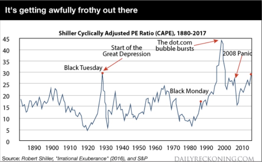
The chart below shows the CAPE from 1870 to 2017. Two conclusions emerge immediately. The CAPE today is at the same level as in 1929 just before the crash that started the Great Depression. The second is that the CAPE is higher today than it was just before the Panic of 2008.

Neither data point is definitive proof of a bubble. CAPE was much higher in 2000 when the dot.com bubble burst. Neither data point means that the market will crash tomorrow.

But today’s CAPE ratio is 182% of the median ratio of the past 137-years.

Given the mean-reverting nature of stock prices, the ratio is sending up storm warnings even if we cannot be sure exactly where and when the hurricane will come ashore.

With the likelihood of a bubble clear, we can now turn to bubble dynamics. The analysis begins with the fact that there are two distinct types of bubbles.

Some bubbles are driven by narrative, and others by cheap credit. Narrative bubbles and credit bubbles burst for different reasons at different times. The difference is critical in knowing what to look for when you time bubbles, and for understanding who gets hurt when they burst.

A narrative-driven bubble is based on a story, or new paradigm, that justifies abandoning traditional valuation metrics. The most famous case of a narrative bubble is the late 1960s, early 1970s “Nifty Fifty” list of fifty stocks that were considered high growth with nowhere to go but up.

The Nifty Fifty were often referred to as “one decision” stocks because you would just buy them and never sell. No further thought was required. Of course, the Nifty Fifty crashed with the overall market in 1974 and remained in an eight-year bear market until a new bull market began in 1982.

The dot.com bubble of the late 1990s is another famous example of a narrative bubble. Investors bid up stock prices without regard to earnings, PE ratios, profits, discounted cash flow or healthy balance sheets.

All that mattered were “eyeballs,” “clicks,” and other superficial internet metrics. The dot.com bubble crashed and burned in 2000. The NASDAQ fell from over 5,000 to around 2,000, then took sixteen years to regain that lost ground before recently making new highs. Of course, many dot.com companies did not recover their bubble valuations because they went bankrupt, never to be heard from again.

The credit-driven bubble has a different dynamic than a narrative-bubble. If professional investors and brokers can borrow money at 3%, invest in stocks earning 5%, and leverage 3-to-1, they can earn 6% returns on equity plus healthy capital gains that can boost the total return to 10% or higher. Even greater returns are possible using off-balance sheet derivatives.

Credit bubbles don’t need a narrative or a good story. They just need easy money.

A narrative bubble bursts when the story changes. It’s exactly like The Emperor’s New Clothes where loyal subjects go along with the pretense that the emperor is finely dressed until a little boy shouts out that the emperor is actually naked.

Psychology and behavior change in an instant.

When investors realized in 2000 that Pets.com was not the next Amazon but just a sock-puppet mascot with negative cash flow, the stock crashed 98% in 9 months from IPO to bankruptcy. The sock-puppet had no clothes.

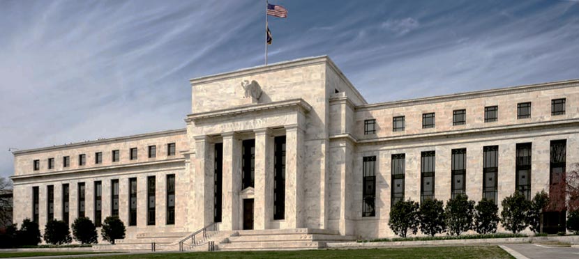
A credit bubble bursts when the credit dries up. The Fed won’t raise interest rates just to pop a bubble — they would rather clean up the mess afterwards that try to guess when a bubble exists in the first place.

But the Fed will raise rates for other reasons, including the illusory Phillips Curve that assumes a tradeoff between low unemployment and high inflation, currency wars, inflation or to move away from the zero bound before the next recession. It doesn’t matter.

Higher rates are a case of “taking away the punch bowl” and can cause a credit bubble to burst.

The other leading cause of bursting credit bubbles is rising credit losses. Higher credit losses can emerge in junk bonds (1989), emerging markets (1998), or commercial real estate (2008).

Credit crack-ups in one sector lead to tightening credit conditions in all sectors and lead in turn to recessions and stock market corrections.

What type of bubble are we in now? What signs should investors look for to gauge when this bubble will burst?

My starting hypothesis is that we are in a credit bubble, not a narrative bubble. There is no dominant story similar to the Nifty Fifty or dot.com days. Investors do look at traditional valuation metrics rather than invented substitutes contained in corporate press releases and Wall Street research. But even traditional valuation metrics can turn on a dime when the credit spigot is turned off.

Milton Friedman famously said the monetary policy acts with a lag. The Fed has force-fed the economy easy money with zero rates from 2008 to 2015 and abnormally low rates ever since. Now the effects have emerged.

On top of zero or low rates, the Fed printed almost $4 trillion of new money under its QE programs. Inflation has not appeared in consumer prices, but it has appeared in asset prices. Stocks, bonds, commodities and real estate are all levitating above an ocean of margin loans, student loans, auto loans, credit cards, mortgages, and their derivatives.

Now the Fed is throwing the gears in reverse. They are taking away the punchbowl.

The Fed has raised rates three times in the past sixteen months and is on track to raise them three more times in the next seven months. In addition, the Fed is preparing to do QE in reverse by reducing its balance sheet and contracting the base money supply. This is called quantitative tightening or QT, which I’ve discussed recently.

Credit conditions are already starting to affect the real economy. Student loan losses are skyrocketing, which stands in the way of household formation and geographic mobility for recent graduates. Losses are also soaring on subprime auto loans, which has put a lid on new car sales. As these losses ripple through the economy, mortgages and credit cards will be the next to feel the pinch.

U.S. Bank Deregulation Advances, But Hurdles Remain

The momentum for U.S. bank deregulation continues to grow, but it is becoming more likely that it will take the form of multiple smaller bills targeting relief for specific segments of the financial sector as opposed to a single, comprehensive bill, says Fitch Ratings.

The Financial Choice Act (FCA) remains the benchmark for the full deregulation agenda given the upcoming House vote on a revised version that was passed by the House Financial Services committee earlier this month. The updated version (FCA 2.0) is mostly in line with the original bill from 2016 and still calls for the full repeal of the Volcker Rule, the Orderly Liquidation Authority (OLA) and the Department of Labor (DOL) Fiduciary Rule.

Broad and deep deregulation is generally viewed by Fitch as likely to have a negative impact from a bank credit risk perspective; however, the ultimate form of regulatory change and its application by individual banks will determine the ratings implication.

A repeal of Volcker is unlikely to result in banks’ returning to full-scale proprietary trading, but it could carry negative rating implications depending on banks’ response. The elimination of OLA could expose the banking sector to significant systemic risk in the event of a crisis, though resolution planning could be a mitigating factor to large bank failures. While eliminating the DOL Fiduciary Rule would likely benefit banks’ wealth management businesses and asset managers’ profitability, reputational and litigation risks would remain.

Key differences between FCA 2.0 and the original bill include simplifying the threshold for banks to opt out of most regulations, changing operational risk weights for global systemically important banks (G-SIBs), replacing the Consumer Financial Protection Bureau (CFPB) and relaxing some components of stress-testing.

Fitch does not believe proposed changes to the CFPB would directly affect most banks’ and non-bank financial institutions’ credit profiles, though they could reduce the regulatory burden and associated costs. Further revision to bank stress testing as proposed under FCA 2.0 is likely to be ratings neutral.

Why Didn’t Bank Regulators Prevent the Financial Crisis?

The St. Louis Fed On The Economy Blog had an interesting article today, looking at why the GFC happened, and how the Dodd-Frank Act has addressed the issues in the US (yes, the one which may be repealed if Trump gets his way).

But, look at the issues in the Australian context and score for yourself to what extent we currently have the same issues here as they did in the US then. Its scary!

A number of observers have questioned whether bank regulators could have prevented the financial crisis of 2008. While many market participants recognized the exuberance of the housing market, other factors contributing to the crisis led to a “perfect storm” that made it difficult for many stakeholders, including regulators, to foresee the impending meltdown.

Excessive Mortgage Debt

Poor assessment of ability to repay and inadequate down payments doomed many mortgages. Insufficient consumer protections resulted in many consumers not understanding the risks of the mortgage products offered.

Dominance of Variable Rate and Hybrid Subprime Mortgages

The spread of variable rate and hybrid subprime mortgages in a low-rate environment created excessive risks when interest rates rose.

Overheated Housing Market

Rapidly increasing house prices encouraged speculation, which further drove up prices. The availability of easy credit caused many borrowers to take on levels of debt they could not afford.

Lack of Market Discipline in Mortgage-Backed Securities Market

Growth in the private mortgage-backed securities market was fueled by lax standards in assigning credit ratings, which hid building systemic risk.

Safety and Soundness Problems at Large Banks

Many large banking firms had insufficient levels of high-quality capital, excessive amounts of short-term wholesale funding and too few high-quality liquid assets. These problems were frequently compounded by inadequate internal risk measurement and management systems.

Risky Behavior by Nonregulated Financial Firms

Sometimes referred to as the “shadow banking system,” this collection of financial firms included insurance companies and captive finance companies, among others. These firms engaged in activities that increased risks inherent in the financial system as a whole without any meaningful regulatory oversight.

Lack of Broad Oversight

Finally, while various regulators oversaw parts of the financial system, there was no one regulator responsible for the consolidated supervision of systemically important financial firms. Moreover, no authority was assigned the responsibility of overseeing systemic risk.

Hard Data, Soft Data and Forecasting

From The St. Louis Fed on The Economy Blog.

People frequently scour economic data for clues about the direction of the economy. But could the many types of data cause confusion on what exactly the state of the economy is? A recent Economic Synopses essay examined some of this potential confusion.

Business Economist and Research Officer Kevin Kliesen noted that data essentially fall into two camps:

  • Hard data, such as that from government statistical agencies used in constructing real gross domestic product (GDP)
  • Soft data, such as business, consumer confidence and sentiment surveys, financial market variables, and labor statistics

Kliesen crafted two index measures of these types of data, which can be seen in the figure below.1 He noted that these indexes could be useful for quantitatively showing how different types of data can influence forecasts of real GDP and, in turn, the expectations of policymakers.

hard soft data

“The indexes exhibit the normal cyclical behavior one would expect in the data: They increase in expansions and decrease in recessions,” Kliesen wrote.

He also noted that the hard data index showed stronger economic conditions from around the beginning of the recent recovery until late 2013. More recently, however, the soft data index is showing stronger economic conditions.

Effect on Forecasts

To show the possible effects of favoring one type of data when forecasting, Kliesen ran forecasts of monthly real GDP growth using only hard data and using only soft data:

  • Forecasting growth using the hard data resulted in projected growth of a little more than 2 percent per quarter through the end of 2019.
  • Using soft data, however, resulted in a peak of a little more than 4 percent in early 2018.

He then compared the results with the consensus forecasts found in the Federal Reserve Bank of Philadelphia’s Survey of Professional Forecasters (SPF) and the Federal Open Market Committee’s (FOMC’s) Summary of Economic Projections (SEP). The results are in the table below.

Forecasts for Real GDP
Percent Changes, Q4/Q4
Hard Data Soft Data SPF SEP
2017:Q4 1.9 3.9 2.3 2.1
2018:Q4 2.2 2.9 2.4 2.1
2019:Q4 2.4 2.5 2.6 1.9
NOTES: The SEP values are taken from the March 15 release and are Q4/Q4. The SPF values use average annual data and are taken from the Feb. 10 issue.
Federal Reserve Bank of St. Louis

Kliesen concluded by saying that most forecasters and FOMC policymakers have relied more on hard data when forecasting. He wrote: “This is probably prudent, since the hard data flows are used in most macroeconomic forecasting models.”

He also noted: “However, as the upbeat forecasts from the soft data show, there appears to be some upside risk to the near-term forecast for real GDP growth. This upside risk likely reflects the widespread expectation of expansionary fiscal policy and a strengthening in global growth.”

Economists are trying to out why incomes aren’t rising — but workers have a good hunch

From Business Insider.

Economists are often wringing their hands over why, despite a continuous eight-year economic recovery, US workers’ wages remain largely stagnant, extending a trend that began some three decades ago.

Yet anyone who has applied for a job in the last couple of years knows that, while the US unemployment rate is historically low at 4.4%, the labour market isn’t exactly bustling.

Companies have become a lot more reticent about making new investments in the wake of the Great Recession and during the weak economic recovery that has followed it. That includes investing in people, and the hiring process has become slower and more onerous.

It also means wage increases have become even harder to come by.

The recession caused lasting damage to the job market which still resonates to this day. Steven Partridge, vice president for workforce development at Northern Virginia Community College (NOVA), says the crisis created what he calls “degree inflation” in job requirements — a trend correlated with stagnant and sometimes falling incomes as workers lost their jobs and considered themselves lucky to take lower-paying ones.

In other words, because applicants were so desperate and the pool was so wide, the bar for hiring became unrealistically, and often unnecessarily high. The trend has abated, but not fully receded.

“The downturn made everyone push up their education requirements,” Partridge told Business Insider.

Several job market indicators point to underlying weakness — high levels of long-term joblessness, low labour force participation and, yes, a distinct lack of wage growth.

Albert Edwards, market strategist at Societe Generale, deserves credit for doing something that’s rather rare on Wall Street — admitting he was wrong, specifically about the prospect of imminent wage increases.

“Talking about wrong, I have to put my hands up. I have been expecting US wage inflation to roar ahead over the past three months to well above 3%, yet every data release has surprised on the downside,” he wrote in a note to clients.

“Wage inflation, as measured by average hourly earnings, has actually leveled off at close to 2-1⁄2% while wage inflation for ‘the workers’ is actually slowing (see chart below)! Strictly speaking, ‘the workers’ are defined (by the BLS) as “those who are not primarily employed to direct, supervise, or plan the work of others.” Hey, that’s me!”

EdwardsSociete Generale

Fed officials have also struggled to understand the absence of wage increases. In a recent research brief from the San Francisco Fed, staff economist Mary Daly and co-authors reflect on what they see as a surprising trend.

“Standard economic theory tells us that wage growth and unemployment are intimately linked. Wage growth slows when the unemployment rate rises and increases when the unemployment rate falls,” they write. “The experience since the Great Recession has been very different.”

SffedFederal Reserve Bank of San Francisco

“This slow wage growth likely reflects recent cyclical and secular shifts in the composition rather than a weak labour market. In particular, while higher-wage baby boomers have been retiring, lower-wage workers sidelined during the recession have been taking new full-time jobs,” they said. “Together these two changes have held down measures of wage growth.”

Their explanation provides little comfort in the face of the depressed labour market many Americans still face, especially lower-income and minority families.

The Fed authors also suggest a factor in low income growth that might ring true to those families: “As long as employers can keep their wage bills low by replacing or expanding staff with lower-paid workers, labour cost pressures for higher price inflation could remain muted for some time.”

As suggested in that last excerpt, labour’s bargaining power vis-a-vis employers is probably at least as important as unfavorable demographics in explaining slow wage growth. It will take a substantially stronger economy to tilt that balance back in workers’ favour.