The Rental Crisis And How NOT To Fix It!

The rental situation is getting worse across the country driven by the pandemic-induced shrinkage in average household size as people demanded more space. This has effectively reduced the number of homes available to rent.

Plus many investors are lifting rentals to try to turn unprofitable investments positive (especially as capital gains on many apartments remains a pipe-dream).

CoreLogic reported that rents across Australia continue to explode, surging by 8.7% nationally and by 10.7% across the combined regions in the year to March 2022.

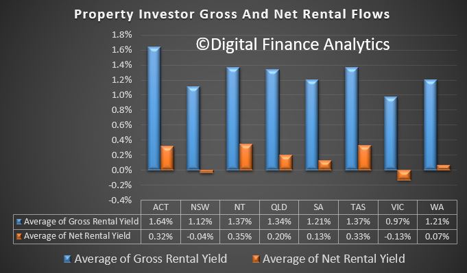
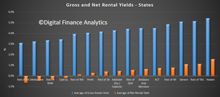
With rental growth (2.6%) outperforming value growth (2.4%) over the three months to March, national dwelling yields have recorded a one basis point rise since December (3.22%) and two basis points since reaching a new record low of 3.21% in January and February. Despite the recent rise, national rental yields are still 32 basis points below the yield recorded this time last year (3.55%).

But BTR is another fake ‘affordability’ policy as a new report in The AFR suggests recent Australian BTR projects charging a 20% premium on traditional rentals.

Its frankly a mess, with long standing consequences for households across the country. Its shameful.

Go to the Walk The World Universe at https://walktheworld.com.au/

Today’s post is brought to you by Ribbon Property Consultants.

If you are buying your home in Sydney’s contentious market, you do not need to stand alone. This is the time you need to have Edwin from Ribbon Property Consultants standing along side you.

Buying property, is both challenging and adversarial. The vendor has a professional on their side.

Emotions run high – price discovery and price transparency are hard to find – then there is the wasted time and financial investment you make.

Edwin understands your needs. So why not engage a licensed professional to stand alongside you. With RPC you know you have: experience, knowledge, and master negotiators, looking after your best interest.

Shoot Ribbon an email on info@ribbonproperty.com.au & use promo code: DFA-WTW/MARTIN to receive your 10% DISCOUNT OFFER.

Rentals Under The Microscope (Part 1)

We have had a number of people asking for some analysis of the rental sector, (including on our recent Live Event, which by the way is still available to watch) as well as in the comments on the channel. So today we take a look, using data from our household surveys, and other sources. This is part one of our latest series.

And by the way, if you value the content we produce please do consider joining our Patreon programme, where you can support our ability to continue to make great content.

To start with, across our surveys, there are 31% of households owning property mortgage free, 28% who have owner occupied property with a mortgage, and 39% of households renting. In fact, in recent years the proportion of households renting has been rising, and faster than the mortgaged sector, which itself is growing.

Looking at average household incomes across those who are owners and those who are renting, it is striking that relatively more households with an income below $100,000 are renting, whereas higher up the income ranges, more are owners. So income is one element which drives property choices, perhaps no surprise there.

Turning specifically to the rental sector, we can look at household income and expenditure, just as we do with mortgage stress. Where expenses, including rental payments are lower than incomes, we classify these households as in severe rental stress. Where income and expenditure is borderline, they are in stress. And here’s the thing. 34% of renters are in stress and an additional 6% are in severe stress, meaning that close to 40% of those renting are living in financial stress, combined. This is compared with 30% of those in mortgage stress. So financial stress is more widespread among renters.

We can take the analysis further by looking at the relative stress distribution by age bands. While stress appears across all the age groups, we find that the bulk of households in severe stress are aged 60 or more. We also see a significant concentration of financial stress more generally here, as well as in those aged 30-39, where we see many young growing families are also under the gun.

Looking across the states, we find that the state with the most stress is NSW, where just 46% of renters have no financial stress, compared with nearly 80% in Tasmania. In addition, we find that 14% of renters in NSW are in severe stress, compared with 5% in VIC and 3% in QLD. This can be directly traced to the average property value, and rental payments, which are highest in NSW.

 Now let’s flip the view to those providing rentals, by looking at investment property owners. We are able to calculate the gross rental yield and net rental yield, the latter after accounting for the costs of managing the property, repairs, etc. as well as repayments on the mortgage.  On average, net rental yields are highest in ACT, TAS and NT, whereas those in VIC are most likely to be under water – in fact many owners, according to our surveys have not even tried to calculate these returns, preferring to look at the capital appreciation, and after tax position. We calculate our returns before any tax breaks, on a cash flow basis.

This means that many investors are NOT covering the full costs of owning a rental property, and of course if capital values fall in real terms, then this becomes a significant drain on household finances, and that’s before the upcoming changes in interest only loans, as they are switched to higher cost principal and interest loans.

So standing back, we can see the on one side renters are under pressure, and on the other so are many property investors, who despite owning the property are also feeling the pinch. This does not bode well for the future health of the market.  In summary we are looking at a major policy failure.

Next time we will go further in to the sector.

Rentals Under The Microscope – Part 1

We review the status of the rental sector, and its not pretty.

Please consider supporting our work via Patreon

Please share this post to help to spread the word about the state of things….

The Property Market
The Property Market
Rentals Under The Microscope - Part 1


Loading


/

Net Rental Yields Under Pressure

We track gross and net rental yields on investment properties via our household surveys. Gross yield is the actual rental stream to property value, net rental is rental payments less the costs of funding the mortgage, management fees and other expenses. This is calculated before any tax offsets or rebates. The latest results were featured in an AFR article today.

The results are pretty stark, and shows that many property investors are underwater in cash flow terms – not good when capital values are also sliding in some places.

This shows the gross and net rental returns by states – Hobart and Darwin are the winners, Melbourne, and the rest of Victoria, then Sydney and the rest of NSW the loosers.

The returns vary between units and houses, with units doing somewhat better.

Here is a view by regions.

We find that portfolio property investors (those with multiple investment properties) are doing the best, whilst new investor buyers are doing the worse, not least because they have larger mortgages to service, and interest rates are higher, and no capital growth.

  Finally, here is the killer slide.  More affluent households are doing significantly better in terms of net rental returns, compared with those in more financially pressured household groups. Batting Urban households, those who live in the urban fringe on the edge of our cities are doing the worst.  This is explained by the types of properties people are buying, and their ability to select the right proposition. Running an investment property well takes skill and experience, especially in the current rising interest rate and low capital growth environment. Another reason why prospective property investors need to be careful just now.

Investor Loan Risk Is Accelerating

Traditionally in the Australian context loans to property investors have tended to perform better than loans to owner occupiers. This is because investors receive rental income streams to help pay for the mortgage costs, they are willing to carry the costs of the property against future capital gains, and many will be able to offset costs against tax, especially when negatively geared. In addition, occupancy rates in most states have been stellar.

But things are changing, as the costs of borrowing for investment purposes have risen (thanks to the banks’ out of cycle rises), while rental returns are flat, or falling and costs of managing the property are rising. The supply of investment property is rising, and occupancy rates are declining in a number of key markets.

So today, we look at the latest gross and net rental yields by using our Core Market Model.

First, we look at yields by type of property. Gross yield is the rental streams received compared with the value of the property; before costs. Net yield is calculated by subtracting the costs of the property, including interest costs on mortgages, management costs and other ongoing maintenance costs. We calculate the net yield before any tax offsets.

Across the nation, units overall are providing a slightly better net return than houses.

By state, VIC has the average worse net rental yield, followed by NSW, while TAS, NT and ACT have the highest net returns.

If we drill down into the regions in the states, we see some significant variations.

If we apply our core market segmentation, we find that more affluent households are getting better returns on average compared with the battlers and younger buyers. Perhaps experience counts.

We also see that Portfolio Investors, those with multiple properties, are on average getting better returns, whilst first time buyers are the least likely to get a positive net return. Again, experience seems to count.

Finally, in the ANZ data today, released as part of their results pack was this slide. It shows a trend which we have been observing too, that is delinquencies are rising faster among property investors (to the point where the same ratio ~0.7% applies to both investors and owner occupiers).

More, concerning, our forward modelling suggests that investors are likely to become a significant higher risk as rates rise, rental returns stall, and occupancy rates fall.  Just one more reason why we think the property investment party may be over.

Higher risks need to be factored into the banks’ modelling, especially as home price momentum is ebbing, so the value of these investment properties may start to fall.

Net Rental Yields Under Pressure

We have updated our gross and net rental yield modelling to take account of recent results from our household surveys, which incorporates the latest movements in rental income, investment loan interest rates, and other costs including agency fees and other ongoing costs. This gives a view of the gross rental yield by state, as well as the net rental yield. We also estimate the after mortgage value of the property.

The average rental property has a gross rental yield of 3.83% (down from 3.9% in September 2016), a net rental yield of 0.22% (down from 0.4% in September 2016) and an average equity value (after mortgage) of $161,450 (compared with $161,798 in September 2016).

There are considerable variations across the country with Victoria and New South Wales both under water on a net yield basis. Tasmania offers the best net rental return.  We have ignored any potential tax offsets.

We can compare the results from the previous run in September. Of note NSW has now dropped into negative net yield territory.

There are a number of factors in play. These include rising interest rates on investment property, a number of new investment property owners, and a weak rise in rents (which tend to follow incomes more than home prices). Agency management fees, where applicable have also risen.

This means that many investors are reliant on the capital gains providing a return on their investment.

Next time we will look at some of the other data views, by segment, property and location. Many investors, in cash terms are loosing money.

Latest Gross and Net Rental Yields Vary; Wildly

We can spot the best and worst investment property returns across the nation, using updated data from our household surveys. The average GROSS rental return in Australia is 3.9%, the NET rental return (after interest costs, management and repair costs etc, but before tax) is 0.4%. The average net equity held in a investment property is $161,798. This is the marked to market value of the property, minus the loans outstanding.

The data takes account of lower interest rates, and changes in rents as well as the latest property values. Things get interesting when we start to look at the segmented data. Not all investment properties are equal. Here is the average by each state.

rental-yield-oct-2016-statesThe left hand scale shows both gross rental yield (blue) and net rental yield (orange), while the line shows the average net equity in the property. We have sorted from lowest net rental return.

In VIC whilst the average gross return is still at 3.3%, the average net return is a 0.2% LOSS, while the average equity is $152,412. Compare this with QLD, with a gross return of 4.5% and a net return of 1.1%, with equity of $154,665. The best net return is to be found in TAS, where gross yield is 5.3%, net yield 1.7% and average equity $141,595.

Another way to look at the data is by our household segments. Here we find more affluent households are getting significantly better net returns (before tax) compared with those with lower incomes, including battlers, those living on the city fringes, and multicultural families.

rental-yield-oct-2016-household-segmentsCutting the data by our property segmentation, we find that portfolio investors are doing the best, with net returns well above 1%.

rental-yield-oct-2016-property-segmentLooking at our geographic bands, we find those on the urban fringe, or suburbs doing the least well. The best returns at a net yield level can be found in the CBD or CBD fringe.

rental-yield-oct-2016-geogFinally, we can drill down to individual postcodes and suburbs. To illustrate this, here is a chart of the 20 worst performers in VIC.  Households in Glenlyon (3461), a suburb of Bendigo about 86 kms from Melbourne are at the bottom.

rental-yield-oct-2016-vic-b20 The average net yield is a LOSS of 3.5%, and a net equity of just $24,000.

Remember that we are looking at the data before tax. Many investors will be willing to wear low net returns on property, to offset other income because of anticipated future capital gains. Negative investment gearing has a big impact on household investment behaviour.

The cost to rent in Australia is still falling

From Business Insider.

The cost to rent in Australia continues to fall, according to new data released by CoreLogic.

In the group’s latest rent review, released monthly, average rental rates fell by 0.3% across Australia’s capital cities in August, leaving the decline on a year earlier at 0.5%.

The decline registered in August was identical to that seen in July.

In dollar terms, the average weekly rent now stands at $481, the lowest level seem since November 2014. From the record high of May last year, the average rent has fallen by 1.4%.

By type of dwelling, the average combined capital city house rent now stands at $484 per week, slightly ahead of units at $466 per week.

Over the past year housing rents have fallen by 0.8%, while those for units have increased by 0.7%. Both sit at record lows.

Source: CoreLogic

The annual fall in the headline index reflects the fact that there are currently more houses than units available for rent in Australia.

This table from CoreLogic shows the change in rents seen across individual capitals over the past month, quarter and year. It also shows current rental yields, comparing them to the levels of a year earlier. Like the annual change in rents, they too sit at record lows.

Though combined capital city rents have fallen over the past year, it’s clearly not uniform in nature.

“Melbourne, Hobart and Canberra have each recorded stronger rental growth over the past year compared to the previous year,” notes CoreLogic. “At the same time, we are experiencing the weakest annual changes in rents on record in Sydney, Brisbane and Perth.”

To Cameron Kusher, research analyst at CoreLogic, the weakness seen over the past year looks set to continue for some time yet.

“As long as wages growth continues to stagnate, coupled with historically high levels of new dwelling construction and slowing population growth, landlords won’t have much scope to increase rents,” says Kusher.

“On the flipside, renters are now in a much better position to negotiate,” he adds.

No Overall Real Income Growth Since 2008 – RBA

There were two important charts contained in the speech by RBA Deputy Governor Philip Lowe today covering the resilience of our own economy, the productivity challenge, the balance in the housing market and the inflation outlook. Real disposable income per capita has been static since 2008, and rent inflation continues to fall. Both indicators of ongoing stress in the economy, especially since household debt is higher than ever, and we have a large share of housing in the investment sector, where we already know some households are in real-terms losing money each month.

This data partly explains the relatively low state of household finance confidence.

While we have done a pretty good job of adjusting to our changed circumstances, the not-so-good news is that growth in real income per capita in Australia has stalled (Graph 5). Indeed, average real income is no higher today than it was in 2008. This follows a 17-year period in which growth averaged a remarkable 3.1 per cent per year. During this earlier period, we benefited from: (i) strong productivity growth in the 1990s; (ii) a very large rise in our terms of trade; and (iii) favourable demographics, which helped increase the share of the population in paid employment.

Static Income RBAThe increase in supply now looks to be contributing to some moderation in the rate of increase in housing prices in these cities. It is also putting downward pressure on rents, with the CPI measure of rent inflation running at just 1.2 per cent in 2015, the lowest for 20 years (Graph 8). Whether or not these trends are maintained remains to be seen, and so we continue to watch developments in the housing market very closely.

Rental Income RBAThe latest data from the RBA chart pack shows again growing debt, and the reduced debt interest burden thanks to ultra low rates. If rates were to rise by even a small amount, in the current low income and low rental environment, this will be a problem.

household-finances