Understanding Household Income, Wealth and Property Footprints

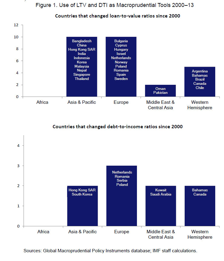
Today we commence the first in a new series of posts which examines household wealth, income, property and mortgage footprints. We will look at the latest trends in LVR and LTI; highly relevant given the tightening standards being applied in other countries, including Norway and New Zealand. We will be using data from our rolling household surveys, up to 9th September 2016.

Today we paint some initial pictures to contextualize our subsequent more detailed analysis, which will flow eventually into the next edition of the Property Imperative, due out in October 2016.

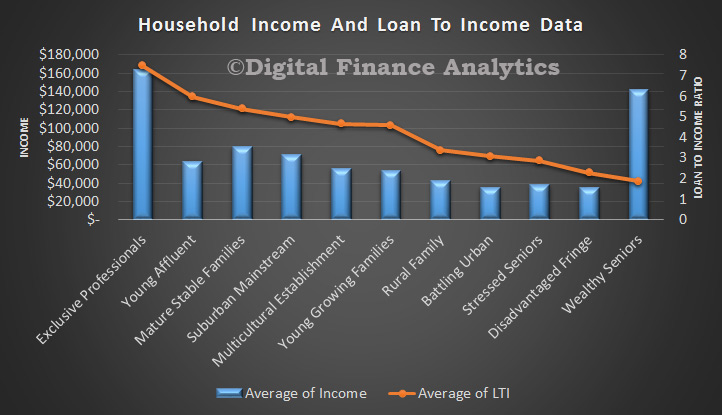
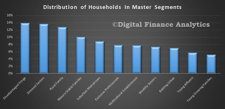
To start the analysis we look at the relative distribution of our master household segments. You can read about our segmentation approach here.

segment-distNext we show the relative household income and net worth by our master segments. The average household across Australia has an estimated annual income of $103,500 and an average net worth (assets less debts) of $600,600; the bulk of which is property related.

segments-income-and-wealth
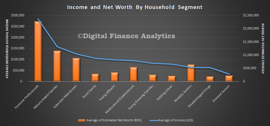
There are wide variations across the segments. The most wealthy segment has an average annual income of more than eight times the least wealthy, and more than ten times the relative net worth.

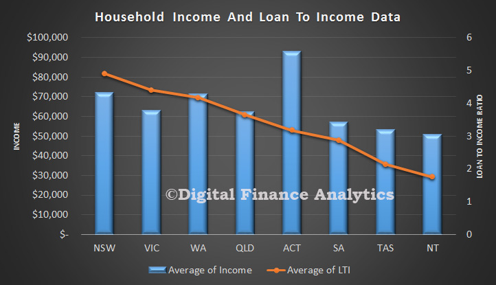
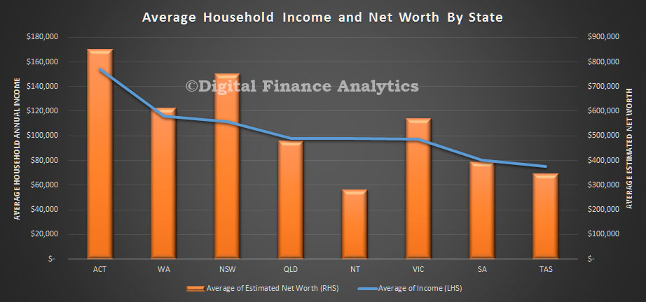
Across the states, the ACT has the highest average income and net worth, whilst TAS has the lowest income (half the income), and NT the lowest net worth (third the net worth).

states-income-and-wealth
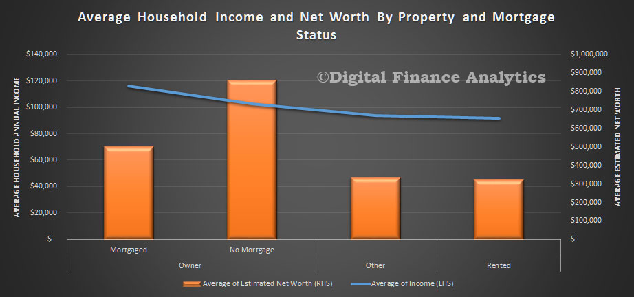
Property owners are better placed, with significantly higher incomes and net worth, compared with those renting or in other living arrangements. Those with a mortgage have higher incomes, but lower net worth relative to those who own their property outright.

propertys-income-and-wealth
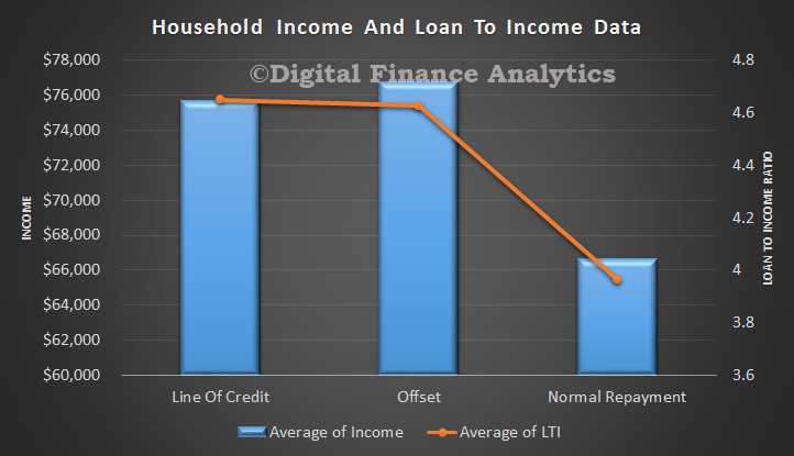
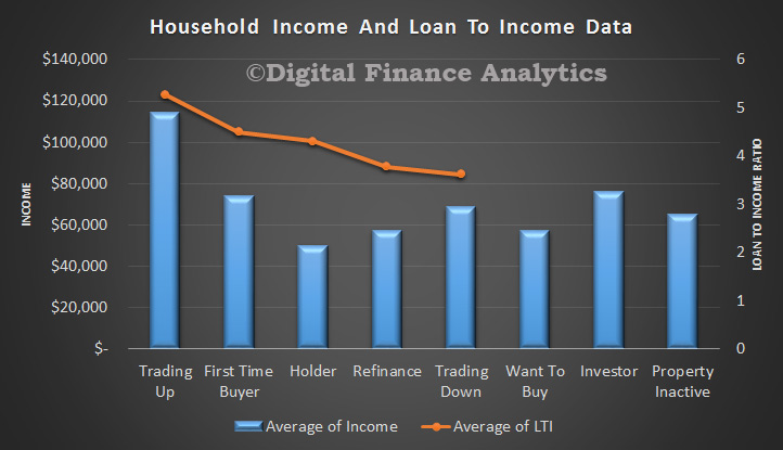
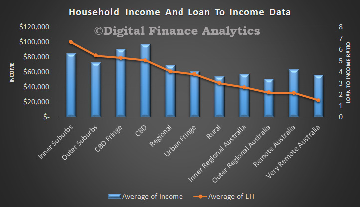
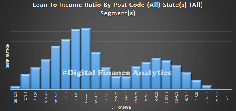
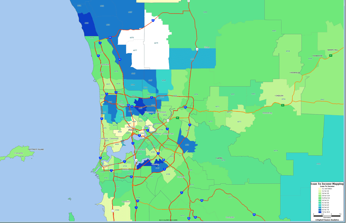
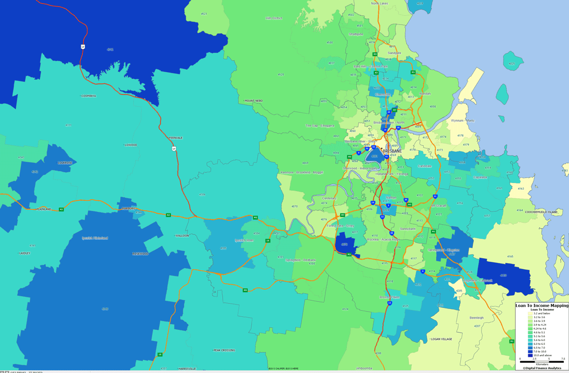
The loan to value (LVR) and loan to income (LTI) ratios vary by segment.

lti-and-lvr-by-segment
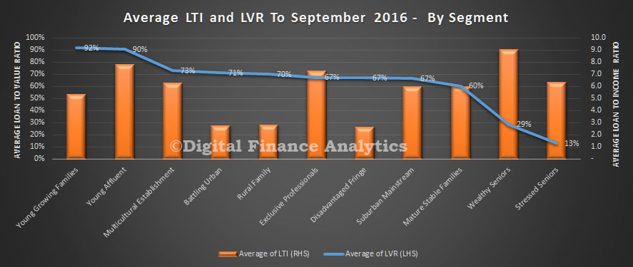
Young growing families, many of whom are first time buyers, have the higher LVR’s whilst young affluent have the higher LTI’s (along with some older borrowers). Bearing in mind incomes are relatively static, those with higher LTI’s are more leveraged, and would be exposed if rates were to rise.

Finally, we see that many loans have been turned over, or refinanced relatively recently, so the average duration of a mortgage is under 4 years.

inception
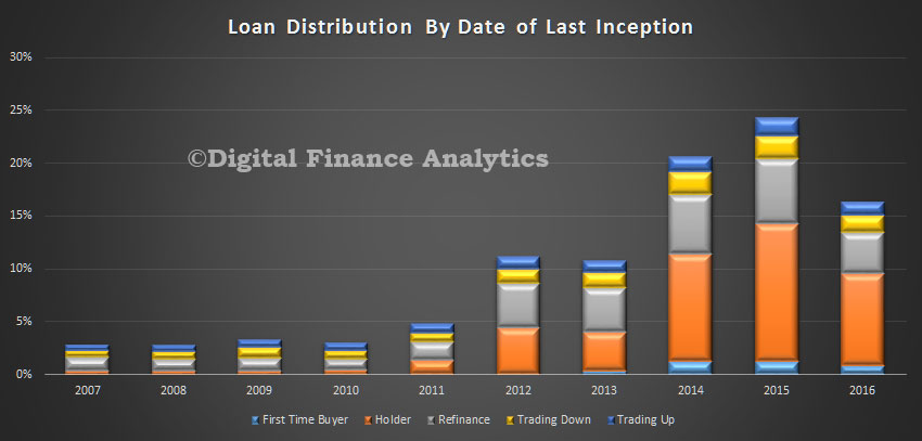
There is a relatively small proportion of much older dated loans which we have excluded from the chart above. Nearly a quarter of all loans churned in 2015, and 2016 shows the year to date count.

Next time we will look at LTI and LVR data in more detail.

Property price to income ratio is rising in Sydney, Melbourne and Canberra

From CoreLogic.

Utilising quarterly household income data from the Australian National University, CoreLogic has developed quarterly measurements of the ratio of property prices to annual household income.  This data is extremely valuable when looking to measure housing affordability.  The measure is available at a number of different geographies from SA2 regions (generally about the size of a suburb or group of suburbs) all the way up to GCCSA (capital city and rest of state) regions.  When looking at the analysis it is important to note that a higher ratio means housing is less affordable and a lower ratio indicates better affordability.

Chart 1
With property prices varying greatly between each of the capital cities it is interesting to note that the variation in household incomes in nowhere near as large.  In March 2016, Hobart had the lowest median dwelling price at $337,250 and Sydney had the highest median price at $775,000.  Meanwhile, household incomes range from as low as $1,175/week in Hobart to $2,118/week in Darwin.  Obviously the differences in property prices and incomes impact on housing affordability, so let’s take a look at each of the capital cities and the ratio of prices to income over time.

Outside of Sydney, Melbourne and Canberra housing affordability is improving with each capital city having a current ratio which indicates affordability has been worst in the past.  The problem is that almost 2 out of every 5 Australians live in either Sydney or Melbourne and these two cities have also been the epicentres of employment and economic growth over recent years.  Deteriorating housing affordability in Sydney and Melbourne impacts on significantly more people than deteriorating housing affordability elsewhere around the country.

This measure of affordability provides a high level overview of the relative housing affordability across the capital cities, but it is important to remember that geographically across each city the affordability story can be dramatically different.  Furthermore, this analysis does not take into consideration interest rates which can make housing affordability more affordable.  While interest rates are undoubtedly a consideration for buyers, they must also consider that interest rates can fluctuate dramatically over the life of a mortgage.

LTV and DTI Limits—Going Granular

DFA analysis of Australian mortgages highlight that we have high LTI ratios, and high LVR ratios, both indicating a build up of systemic risks in the system. We used postcode level analysis, and believe that it is essential to “get granular”.

Now the IMF has released a working paper on the effectiveness of using loan-to-value (LTV) and debt-service-to-income (DTI) limits as many countries face a new round of rising house prices. Yet, very little is known on how these regulatory instruments work in practice. This paper contributes to fill this gap by looking closely at their use and effectiveness in six economies—Brazil, Hong Kong SAR, Korea, Malaysia, Poland, and Romania.

IMF-LTI-LVRIn most cases,the caps on LTV and DTI started in the range of 60–85 percent and 30–45 percent, respectively, for mortgage loans. In all countries, there were changes to the limits of LTV/DTIs typically because the authorities noted that they were not having the desired effect. In some cases, house price and mortgage growth did not fall, and in other cases, the limits did not bind. Concerned with speculative activities, authorities in some countries lowered the caps selectively either for speculative prone (geographical) areas or for individuals with multiple mortgages. In one case, the centrally set caps were removed and banks were allowed to set their own limits, validated by supervisors. However, this did not work, and stricter requirements were put back in place.

To curb leakages, the limits were extended in some of the countries to insurance companies, mutual funds and finance companies that advertised mortgage products. It was also extended to development financial institutions.

Insights include: rapid growth in high-LTV loans with long maturities or in the number of borrowers with multiple mortgages can be signs of build up in systemic risk; monitoring nonperforming loans by loan characteristics can help in calibrating changes in the LTV and DTI limits; as leakages are almost inevitable, countries strive to address them at an early stage; and, in most cases, LTVs and DTIs were effective in reducing loan-growth and improving debt-servicing performances of borrowers, but not always in curbing house price growth.

Note: The views expressed in this Working Paper are those of the author(s) and do not necessarily represent those of the IMF or IMF policy. Working Papers describe research in progress by the author(s) and are published to elicit comments and to further debate.

Getting To Grips With Loan To Income

We think that the ratio of loan outstanding to income (LTI) is a good indicator to assess the health of a mortgage loan portfolio, especially when incomes are not rising fast. In Australia, there is no official data on LTIs, from either the statistical or supervisory bodies, or from individual lenders. We think this needs to change. Internationally, there is more focus on the importance of LTI analysis, and LTI is regarded by many as the best lens to assess potential risks in the portfolio. We highlighted the New Zealand analysis recently.

We recently analysed data from our household surveys and presented some of the data in an earlier post, comparing LTI with LVR. Today we look further at the relationship between LTI and income, again using the DFA household data. We find significant variations. The data takes the current loan balance, and current income data (not that which may have existed when the loan was written initially).  Not all banks appear to update their customer income data regularly, so many will not know the true state of play. When incomes are rising fast, as happened in the early 2000’s, this was probably not a issue, but now with income growth slowing, and loans larger, this is much more important.

The first chart shows the income scale on the left, and the LTI on the right, and we look at the loan size across the page. We see that LTI’s tend to be lower and more consistent up to about $300k, but as the loan size rises above this, the loan to income ratio varies significantly. Some borrowers with large loans have an LTI on 15-20. These larger loans will be assessed by lenders on other factors, including assets and other investments held.

LTI-and-Income-By-Loan-Value-Apr-2015Now, lets shift the lens to the various mortgage providers. I have disguised the individual lenders in this chart, but this shows the average LTI of all mortgages outstanding, and average household income by provider. The highest portfolio has an LTI of above 6, the lowest, half as high. It is fair to assume therefore that banks use different underwriting criteria to grant loans. All else being equal, higher LTI is higher risk.

LTI-and-Income-By-Provider-Apr-2015So now lets look at interest only loans versus normal repayment loans. This is important because interest only loans make up more of the portfolio,  We see that the LTI is somewhat higher on an interest only loan, though these loans on average tend to align with slightly higher income.

LTI-and-Income-By-Int-Only-Apr-2015We also find that normal repayment loans, compared with a line of credit or offset loan, have a lower LTI, and income.

LTI-and-Income-By-Type-Apr-2015We find that households whose education level reached university have higher incomes, and a higher LTI compared with households who left after education at school level.

LTI-and-Income-By-Edu-Apr-2015Looking at the DFA segments, we find that those trading up, and first time buyers have the highest LTI, but there is a significant difference in average incomes between the two. We do not capture LTI data for Want To Buys, Property Inactive households or Investors. We also see that those who own property, with no plans to change, have a lower average income than those aspiring to enter the market.

LTI-and-Income-By-Pty-Segment-Apr-2015We have sorted the data by our core segments, and see that the Exclusive Professional segment has the highest income and the highest LTI. But note how the Young Affluent have an average LTI of around 6, yet their income is significantly lower. Those stressed households generally have significantly lower LTI’s so we can see that underwriting criteria does vary by segment, and the lowest LTI resides amongst Wealth Seniors.

LTI-and-Income-By-Segment-Apr-2015Another lens is the DFA geographic bands. Here we find that households in the inner suburbs have the highest LTI, around 6, whilst both income and LTI drift lower as we migrate into the more remote regional areas.

LTI-and-Income-By-Band-Apr-2015Finally, up to now we have used national averages, but it is worth highlighting that average incomes and LTI do vary across the states. NSW has the highest LTI, around 5, whilst NT sits around 2. Average household income is highest in the ACT, but NSW and WA also have higher levels of average income, compared with some of the other states.

LTI-and-Income-By-State-Apr-2015We think there is important work to be done to apply risk lenses across LTI bands, and we believe we need reporting on this important aspect. Without it, we are flying blind.

Household Debt Burden Increases Again

Using the RBA household ratios, we can look at the effect of debt on the average household. It blows up the myth of “household deleveraging”, much talked about after the GFC. Whilst the average data masks the differences between different household segments (see the segmented analysis in our survey and we know debt is becoming more concentrated in some households, whilst others pay down), it can tell a story. The first chart shows the ratio of housing debt to income, and we see it has been rising steadily since 2013, and is substantially higher than in 2000. The other point to note is that the ratio of housing debt to assets is down a bit, thanks to house prices rising faster than debt. However, households have never been so in debt.

HouseholdRatios2Another way to look at the data is to compare the ratio of interest payments to (quarterly) average income. We see that with rates currently low, the ratio is down from its high in 2008. However, it is worth noting the average home loan rate has fallen further compared with the housing interest payment to income ratio. This is because relative to income the average mortgage is bigger today – reflecting elevated prices and higher loan to value ratios.

HouseholdRatios1This is consistent with the loan to income ratios we highlighted earlier and a fall in real incomes. More evidence the RBA should act!

Mortgage Stress Coming To A Household Near You

We have updated our mortgage stress models, to take account of the latest tranche of economic data, including falling real incomes, potential uplifts in capital requirements and inflation running hot, so creating the need to lift interest rates; and demand for property continuing to go ahead of supply. Our recent post the Anatomy of Mortgage Stress explains our modelling assumptions, and importantly the definitions of stress we are using. We also explained why households are highly vulnerable to mortgage stress, because of larger loans, and flat incomes in our article If The Worm Turns. Today we will look at our projections out to 2017, once we factor in these various drivers. It is only one scenario, but this is our central case.

We use a series of questions to diagnose mortgage stress focusing on owner occupied households. Through these questions we identify two levels of stress – Mild and Severe.

  • Mild = households maintaining repayments, but by reprioritising expenditure, borrowing more on loans or cards, and refinancing
  • Severe = households who are behind with their repayments, are trying to sell, are trying to refinance, or who are being foreclosed

First we will look at the Australia-wide projections. We expect to see stress amongst first time buyers lift considerably from its current relative low levels. If rates do rise, unemployment stays high, and incomes continue to languish, then by 2017, we think that 40% of first time buyers will be in mortgage stress. Many who brought in the 2008-2009 boom are likely to be hardest hit. More recently the number of first time buyers has fallen to a long term low, so the number of more recent first time buyer households in stress will be lower.

MortgageStressSept2014We can look at the state variations. We see that VIC and QLD first time buyers are more likely to be impacted, whilst SA households less so, with WA and NSW first time buyer households sitting in the middle. This is partly a function of absolute house prices, and partly a function of income and unemployment trends across the states. We did not include the smaller states on the chart, but they are included in the average.

MortgageStressFTBSept2014Finally, we look at the other, non-first time buyer households. Many continue to pay more than the minimum monthly mortgage repayments, taking advantage of the current low rates so they have some protection. However, as rates and unemployment bites, some households who have held property for some time will also experience stress. By 2017 up to 15% of established households will be in stress in our central scenario.

Our research suggests there is an 18 month to 2 year grind between the onset of stress and households taking bold steps (or forced to) like selling up. Before that, they often get into the debt cycle of more credit card debt, refinancing, and a general hunkering down to try and keep the mortgage payments going. It is the broader economic impact of this refusal spend which will have a significant dampening impact on economic growth. In addition the outworking of stress leads to selling a property, so we would expect to being to see some forced sales in 2017 and beyond, another reason why we think house prices are likely to correct to more normal loan to income ratios.

In coming posts, we will look further at the state and postcode level data.

NSW First Time Buyer Trends From 2002

As part of our household surveys we have been examining the state of play for NSW first time buyers since 2002. In our research we have identified the year in which they purchased, whether they subsequently refinanced, or moved on, and how many of these households are currently having difficulty in finding a lender to refinance with. To be clear, this is a snapshot, as at August 2014, across multiple cohorts.

The data shows, firstly the monthly volume of loans written for first time buyers, peaking in 2009, and now languishing at a 20 year low. Next we plot, by age of the purchase, what proportion of households have subsequently either refinanced an existing loan, or sold and bought elsewhere. Perhaps it is not surprising that loans which are older, are more likely to be churned. The yellow trend line shows the proportion of households, by year of origination who have tried, but have not so far been able to refinance their loan. We see a significant peak in loans written in the 2009 boom time (when first time buyer incentives were at their peak, both at a federal and state level in a response to the GFC). More recent loans are less likely to be churned, so we see the drop in recent month. This suggests that there are a number of households in the 2009 and 2010 cohort who are in some strife.

First-Time-Buyers-NSWWe also analysed data on their current levels of mortgage stress, and their loan to income (LTI) ratios. We found that the average LTI grew steadily through the 2007-2012 cohorts, and currently stands at close to 6 times current gross income. We also see a peak in mortgage stress, in those households who took a loan in the 2009-2012 period. The proportion in mortgage stress are lower in the cohorts before and after this period. Once again the data highlights potential issues in specific cohorts, who are highly sensitive to unemploymentfalling income or rising rates.

First-Time-Buyers-LTI-NSWThis data also is a warning, that first time buyer incentives can pull households into the market, and lay potential long term problems for them.

Bloomberg’s Summary Of The Australian Housing Market.

Bloomberg Australia has published a compelling overview of the housing market in Australia. They underscore the relatively myopic stance of the regulators. DFA was cited in the article.

Australia has the third-most overvalued housing market on a price-to-income basis, after Belgium and Canada, according to the International Monetary Fund. The average home price in the nation’s eight major cities rose 16 percent as of June 30 from a May 2012 trough, the RP Data-Rismark Home Value Index showed.

In Sydney, the most populous city, where price growth has been strongest, values soared 15 percent over the past 12 months. That compares with a 5.4 percent increase in New York City in April from a year earlier and a 26 percent jump in London prices in June quarter from a year ago.

“There’s definitely room for caps on lending,” said Martin North, Sydney-based principal at researcher Digital Finance Analytics. “Global house price indices are all showing Australia is close to the top, and the RBA has been too myopic in adjusting to what’s been going on in the housing market.”

Worth recalling the chart we published recently on Loan to Income By Post Code.

LTIAllStates

Perth Loan To Income Data By Post Code

Today we continue our series on Loan To Income mapping, based on the results from our household surveys. Looking at the data from the west, we see some interesting differences between post codes. We see higher LTI’s in some of the newer suburbs.

PerthLTIYou can compare this with the WA mortgage stress data here. One again we see a correlation between mortgage stress and high LTI ratios.

The highest LTI post codes in WA are:

HIghestLTIPerthThe lowest LTI post codes in WA are:

LowesttLTIPerth

Brisbane Loan To Income By Post Code

We continue our series on Loan To Income ratios, using data from our households survey with a look at Brisbane. We start with a geomapping of LTIs across the region. The blue areas have the highest ratios.

BrisbaneLTIHere is a list of the highest areas across QLD:

HighestLTI-BrisbaneHere is a list of the lowest areas across QLD:

LowestLTIBrisbane

There is a strong correlation between high LTI and mortgage stress. Details of mortgage stress in Brisbane are here.

You can read our earlier posts about LTI here. This includes similar data on Melbourne, cross state analysis, and comparisons with the UK. We will published additional state data later.